
TL;DR: Purchasing pens made for a different market can mean some changes are needed to make them fit. In the Japanese market, I often find F nibs thinned to EF and tuned to write glass-smoothly. But, sometimes, I find nibs further turned downward, closer to the Sailor Concord specialty nibs than to the narrow down-turn of the Pilot Falcon or Posting nibs. This rare example of a Montblanc 121 Burgundy with 18k nib, ground from F to EF, turned into a Concord shape, has had artisanal work in these two directions.
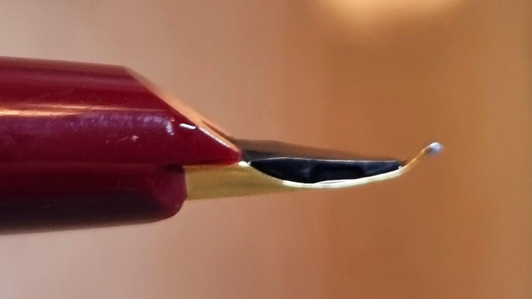
What is a Concord nib? (see Figure 1) Technically, it’s a brand name from Sailor, a nib sold only in their line of Special Nibs pens, alongside a Fude (brush) nib, several kinds of Naginata Togis (larger tips, sturdier nibs), etc. But Concord nibs have come to be associated with a shape: A Concord is any nib that is strongly turned downward toward the tip, in contrast to the straight structure of most other nibs, and opposite of the extreme upward turn of the Fude nibs.
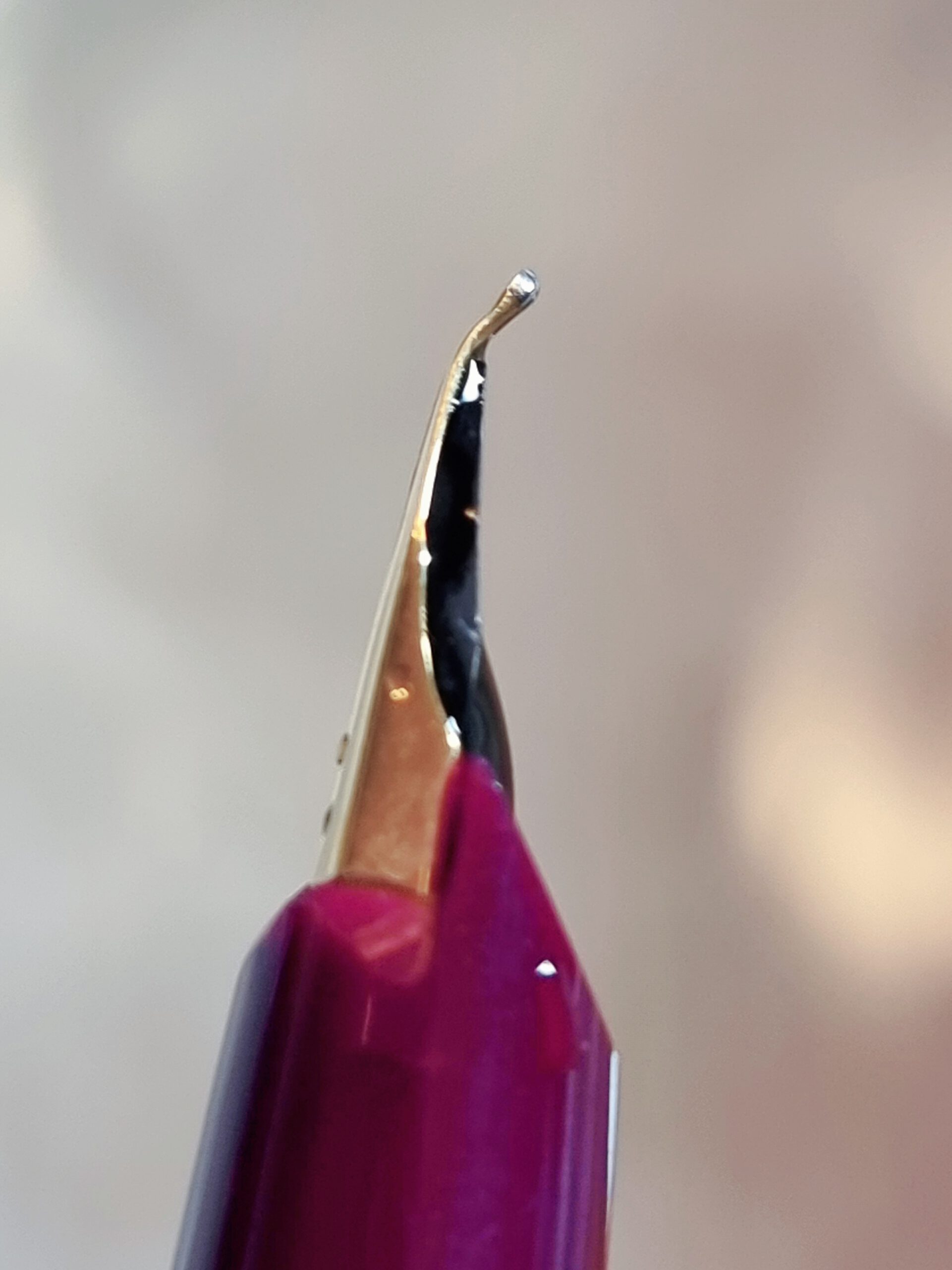
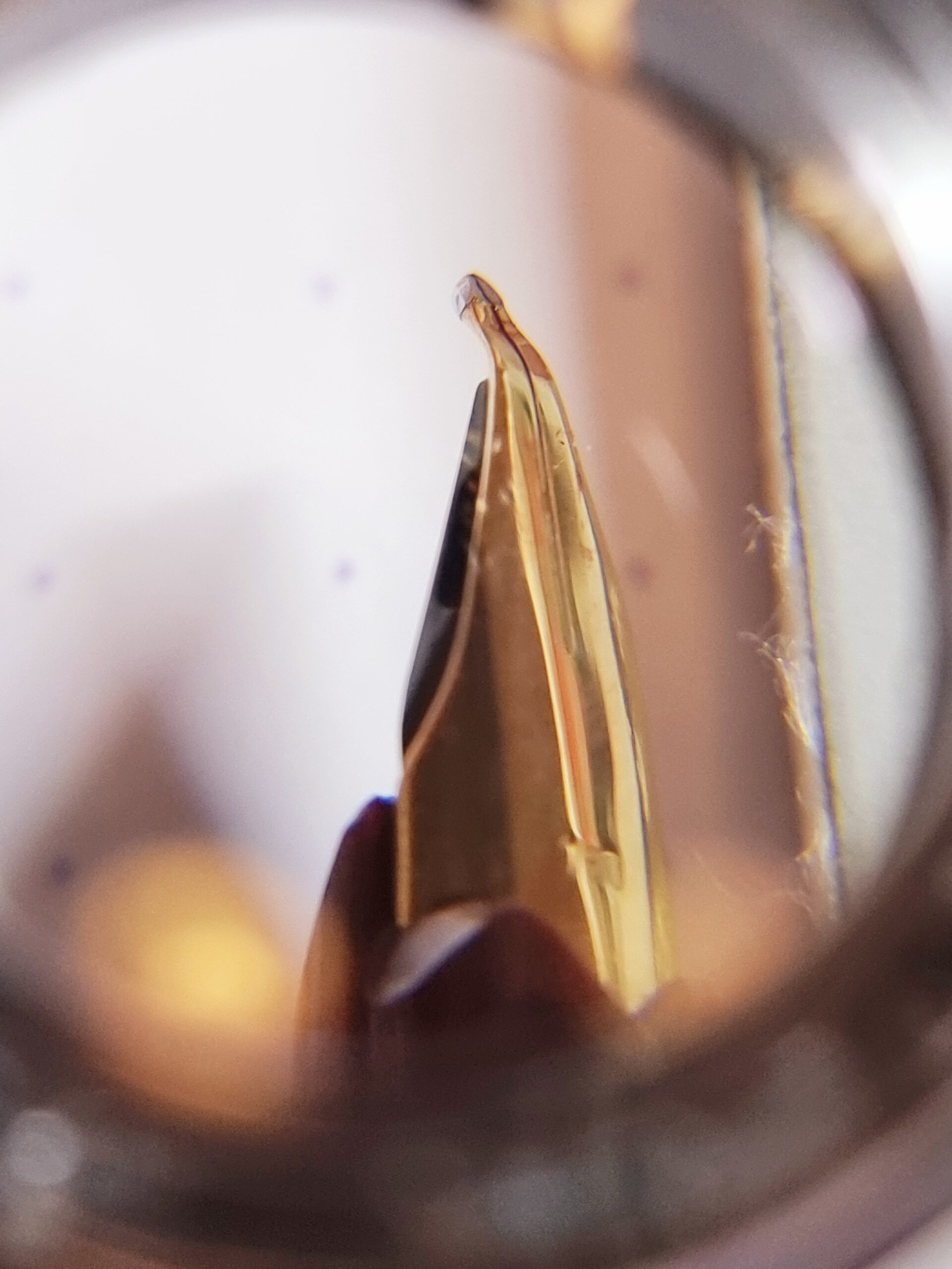
Care to see more? Figure 1 depicts the Concord nib under a magnifier. Figures 2a, 2b, and 2c detail the three-quarter, under-, and sideview of the Concord nib on this Montblanc 121 pen, respectively. The remarkable turn, on the side near the tip of the nib, is easy to see. The turn is sharp, then the turned part is kept straight. This begs the question…
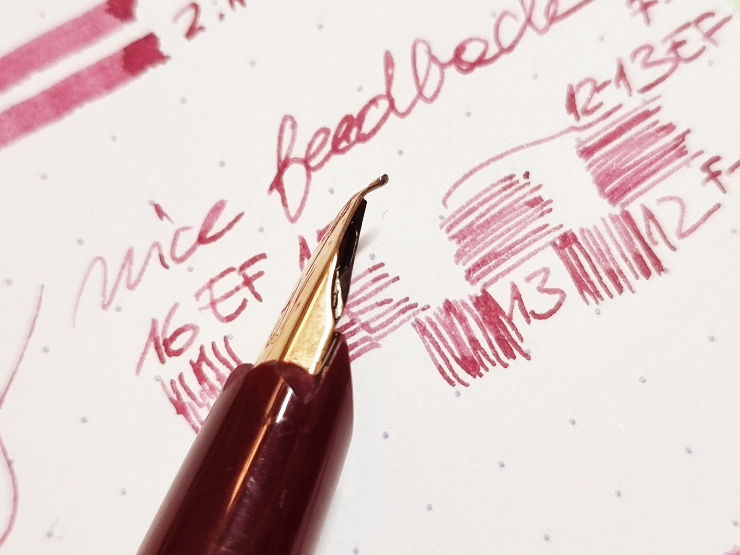
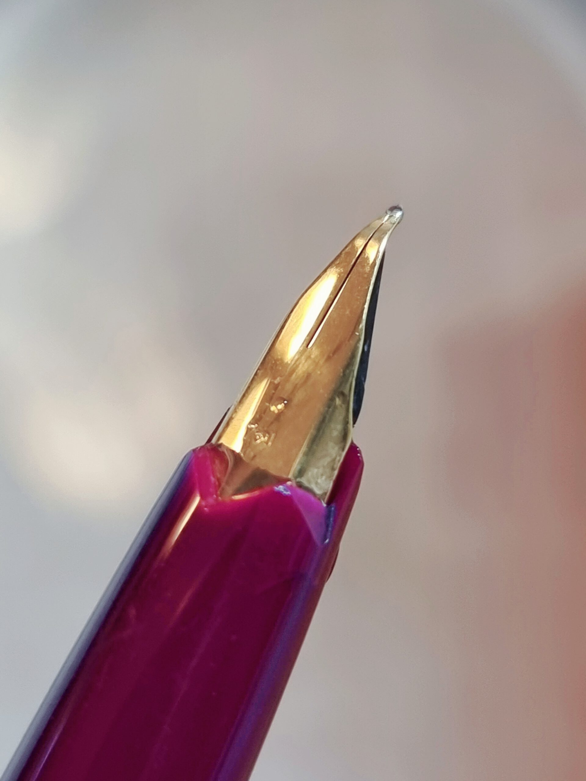
Why are Concord nibs built this way? (see Figures 3a and 3b) The answer is implied by the shape of the nib. When holding the pen normally, so looking at the nib from the top and leaving the feed underneath, the pen has its most acute and narrow tip, which in this case is ground to extra-fine (F to nearly EF, see Figure 3a). This means that the pen is ready for writing, for sketching, or for drawing details. The turn of the nib also means the pen can be held at a lower position, which declutters the spot where the nib rtouches the paper while drawing. It is a very comfortable yet accurate hold, and the visual aid given by the bright nib helps with getting the strokes just right. It’s a precision instrument done right.
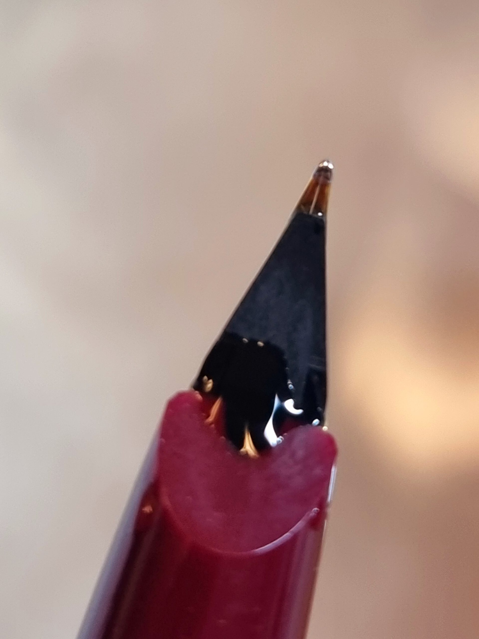
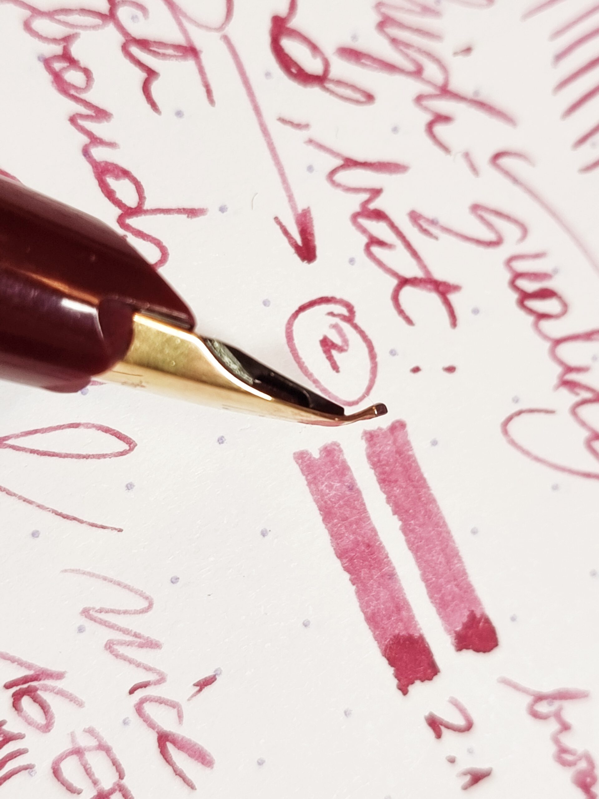
When holding the pen in reverse, so feed upwards, the straight part after the turn acts like a wide brush, leaving extra broad marks (see Figure 3b). Here, they are 2.1 to 2.4 mm broad, which is really very broad and very unusual for a Montblanc (Montblanc 3B is about 1.6 mm, e.g., in the Montblanc x Fritz Schimpf Special Edition The Expressive, which costs in the range of €2,000 on account of the expressive range of its nib). It is a very good way to drop a lot of ink, marking shadows with quick strokes, and, with enough skill and control, strokes that go for extra broad down to broad and even medium size for special elements (e.g., Japanese leaves are drawn this way in classic paintings).
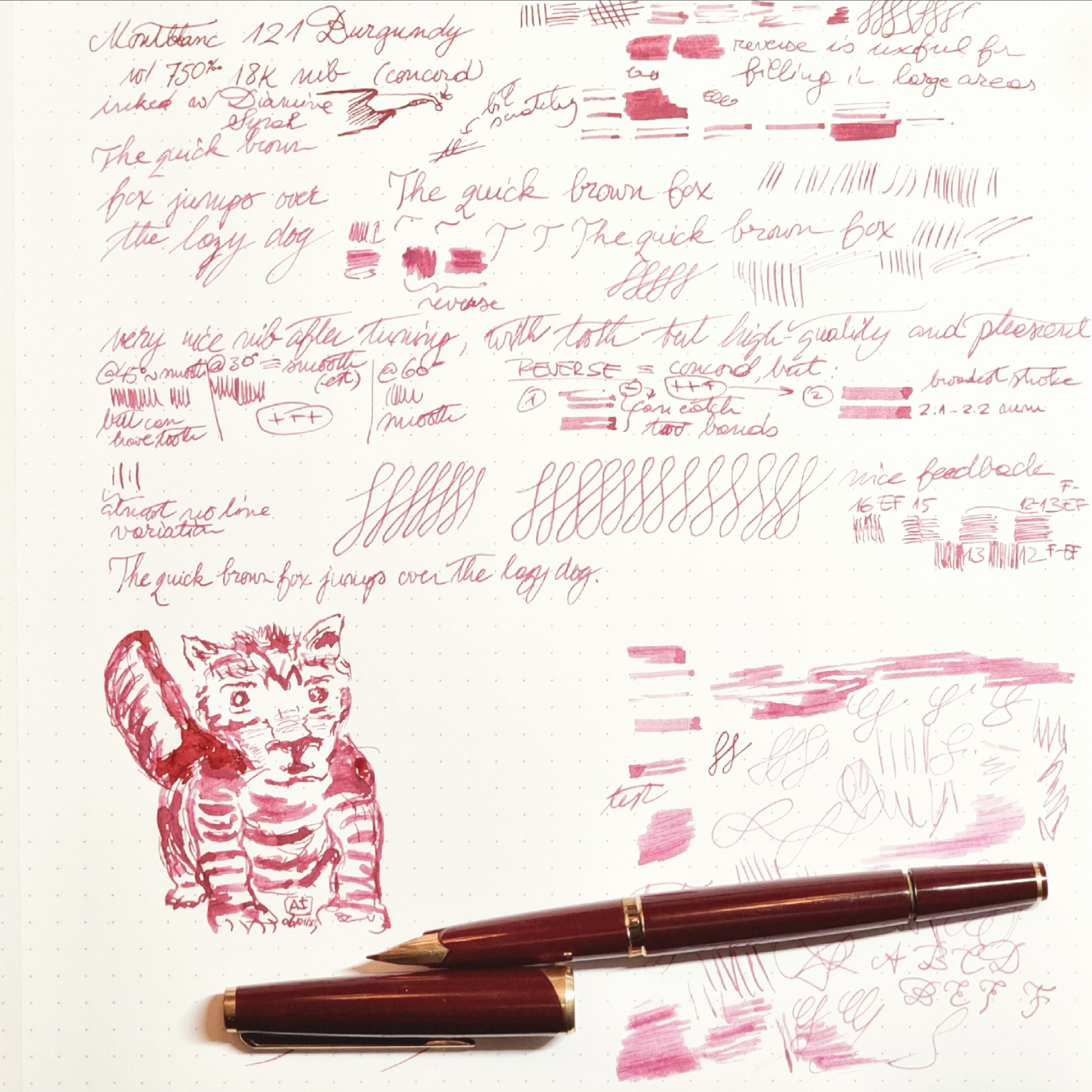
So, altogether, a very versatile nib, good for writing, sketching, and drawing (or painting) in ink (see Figure 4). Just don’t try to flex it, it’s not made for this.
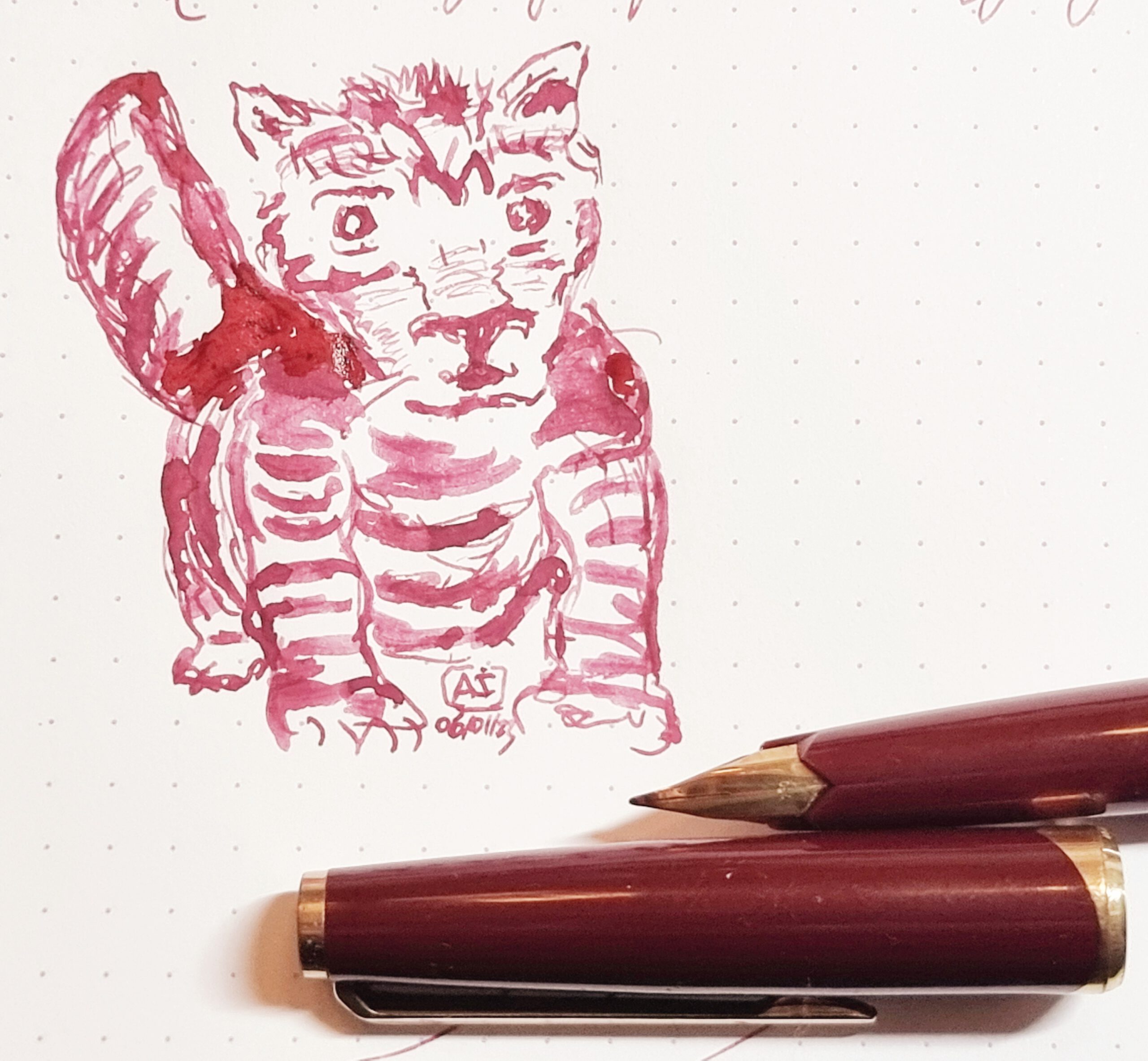
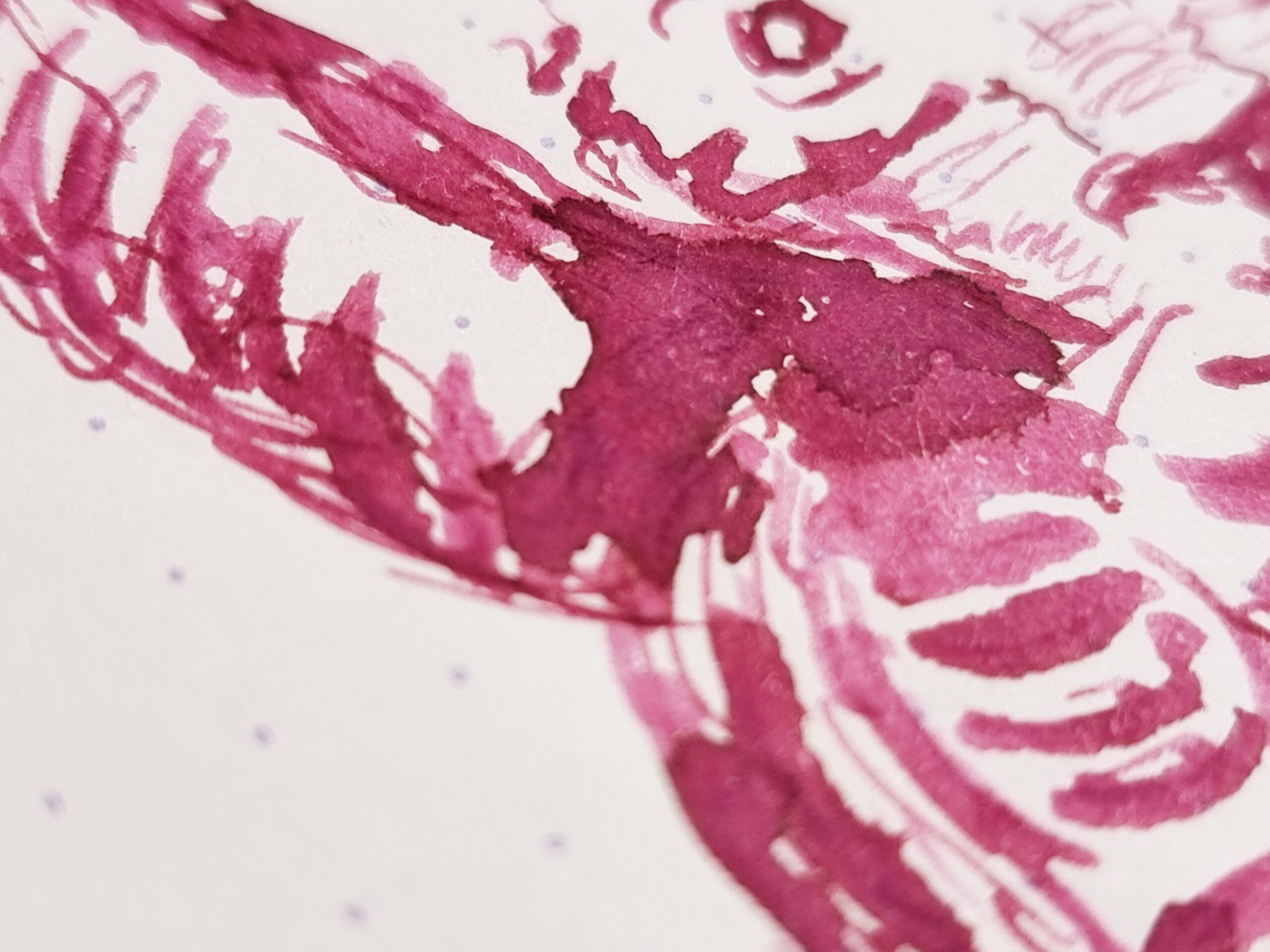
A particularly useful feature of this nib is its ability to put down large volumes of ink, quickly. This enables quick and versatile shading, see Figures 5a and 5b.
Why wouldn’t the nib-turn extend more of the nib downward? Why not go for 3, 4, or 5 mm strokes? The answer is that the structural integrity of the nib, the ability to feed it with ink, and the control afforded to the user are all affected by where the turn is added. Thw flat surface is not particularly stable, and making it longer would make normal writing more unstable.
The feed stops at the nib – unless a clever design can alleviate this problem -, so longer parts after the turn increase the likelihood the capillar pressure, viscous flow, and other physical laws related to ink could break down. Perhaps with wetter inks one couls feed a longer straight part after the turn.
The ccontrol of such a nib is an acquired skill. Here, control refers to the ability to vary the stroke width, from the full width (maximal breadth) to less than half of it (here, a medium stroke is possible). The longer the straight part after the turn, the more control becomes difficult.
And what about the pen itself? The Montblanc 121 is remarkable as a Meisterstück (flagship) pen of the 1970s and one of the finest manufactured by the Montblanc meisters.
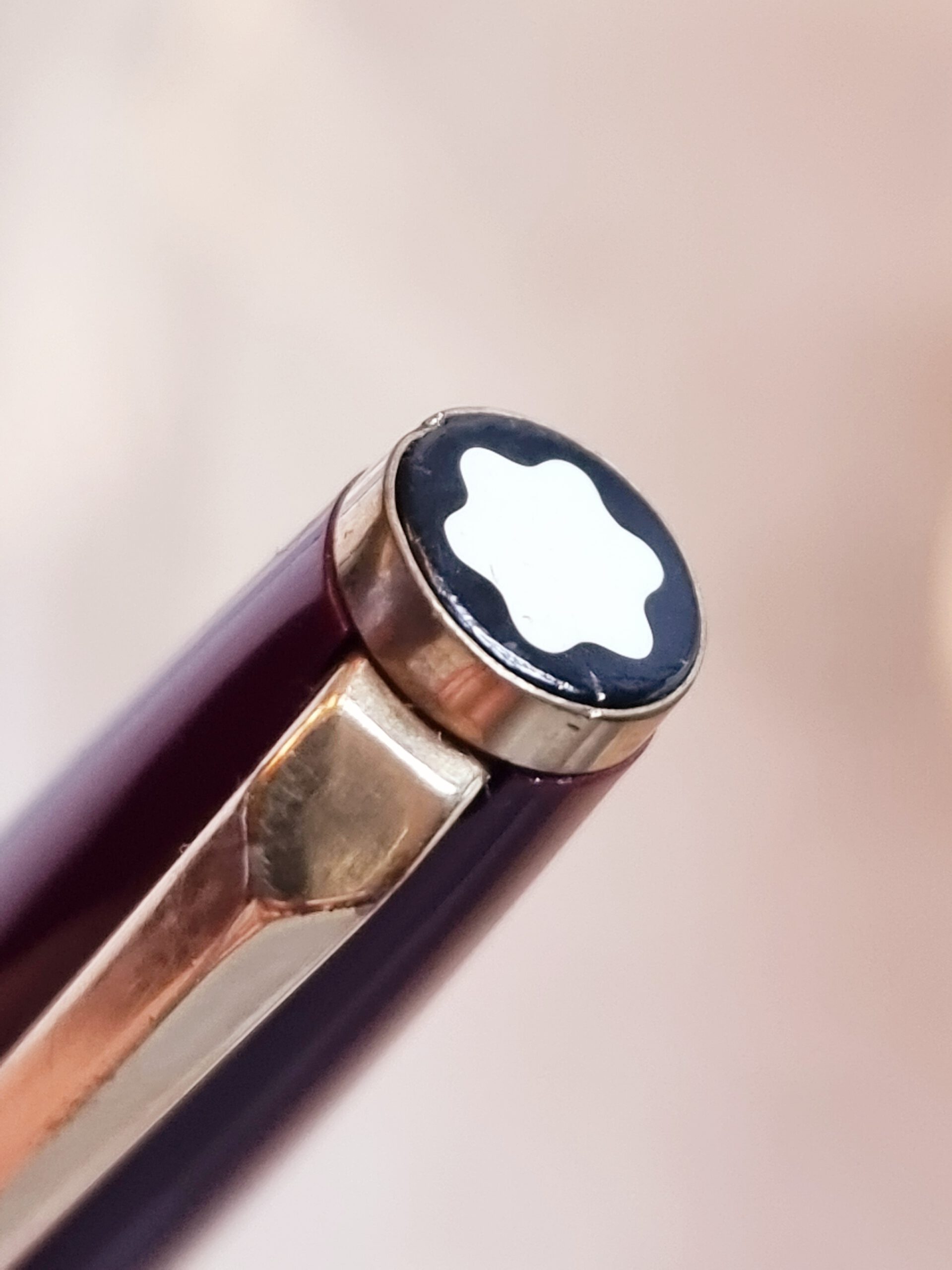
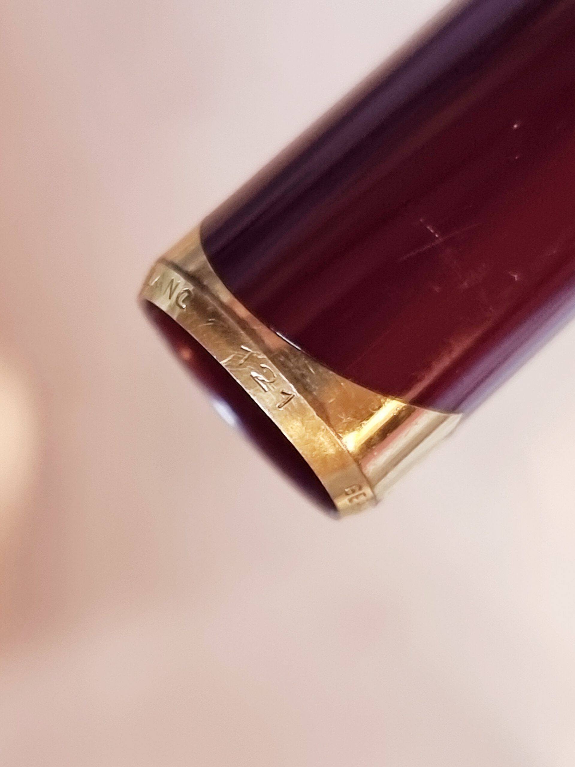
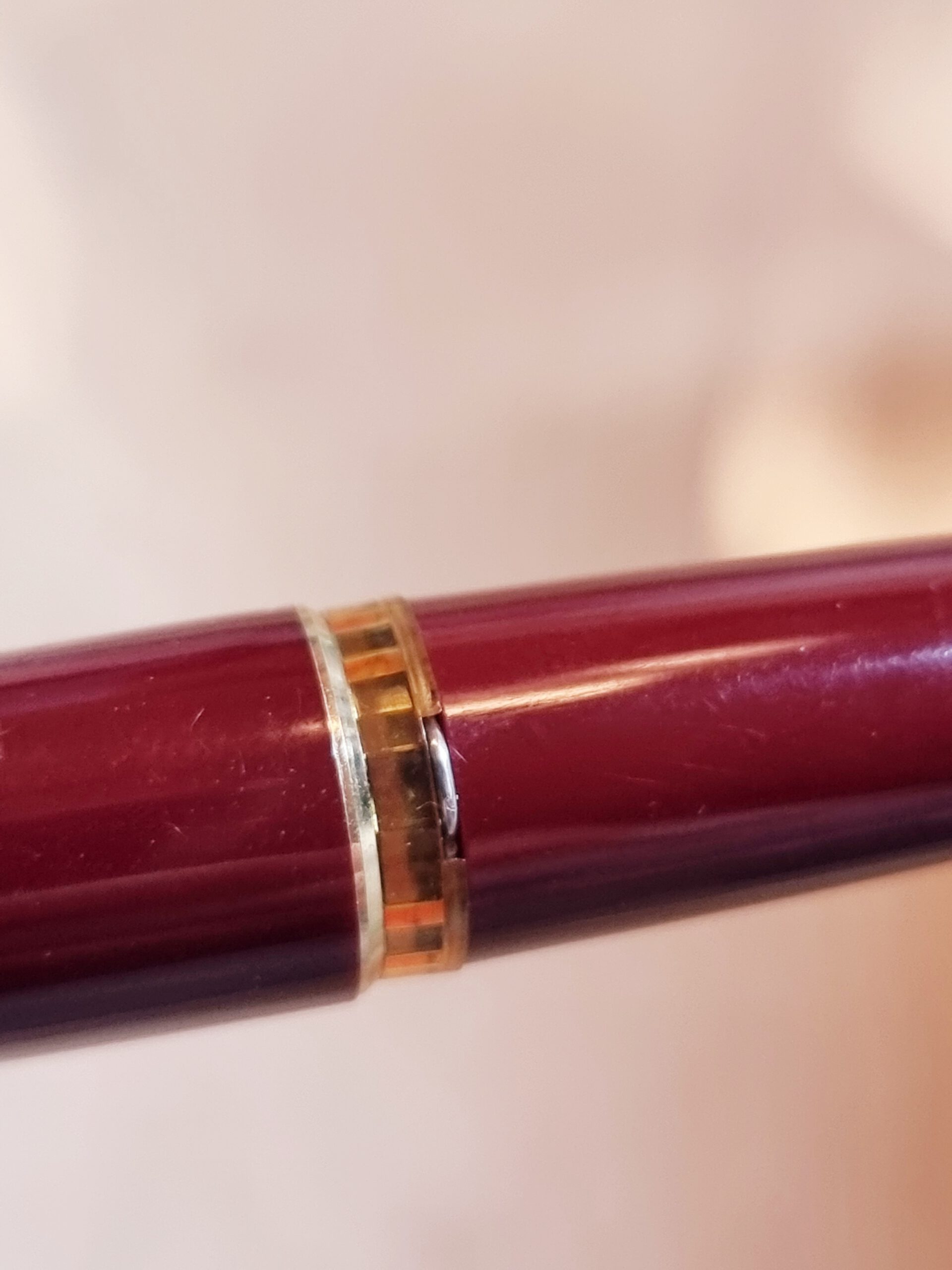
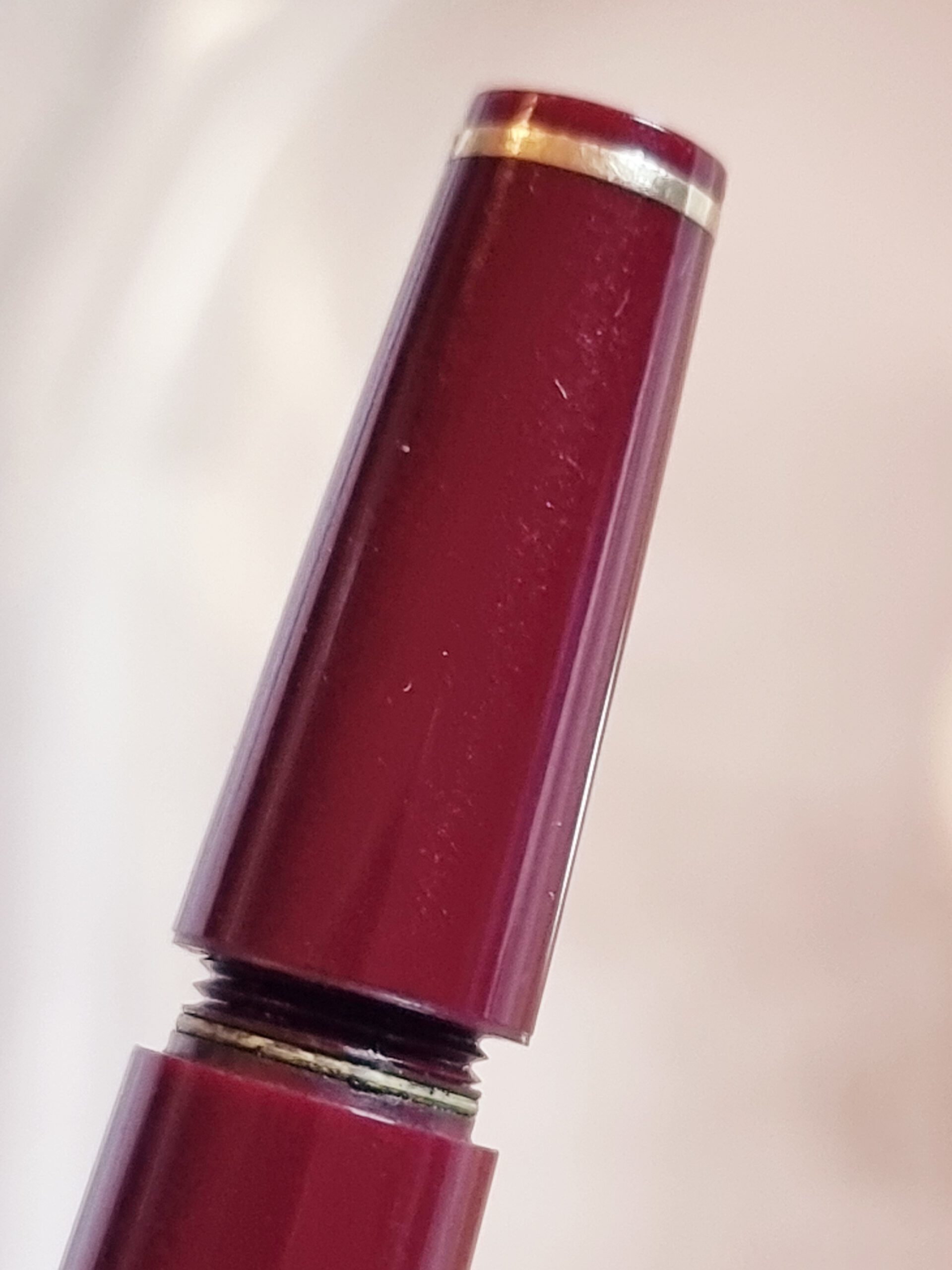
The pen is a form of fine art and craft for the masses, with many details (see Figures 6a – 6d). Everything is crafted exceptionally well, and nearly 50 years after this pen was made it still works as new.
What makes this pen even more remarkable is the color of the material. According to [RW01, p. 67], the colored Montblanc 121 pens were made for export only, and for the wine red (Weinrot, Burgundy) color there is ‘no proof’ that it exists. (I can confirm this pen is real, and I’ve seen several on the market, but overall they seem rare.)
Conclusion: Concord nibs are excellent for sketching, drawing, and writing, in this order.
Enjoy the weekend!
References
- Jens Rösler and Stefan Wallrafen, Collectible Stars: Montblanc writing instruments from 1946 to 1979, 2001. Abbrev. RW01.