
TL;DR: This is the first flexy gold nib I’ve ever tried. A vintage, late-1950s pen, made in Germany. This 14k-gold OB nib of a Geha 605 is a pleasure to write and draw with. Also easy to clean, Geha reserve ink mechanism notwithstanding.
First impression: Outstanding! (see Figure 1a) I received this pen and immediately liked it. There’s something special about a 1950s black pen, gold trim, with lots of marks of quality, featuring a well-preserved 14k-gold OB nib.
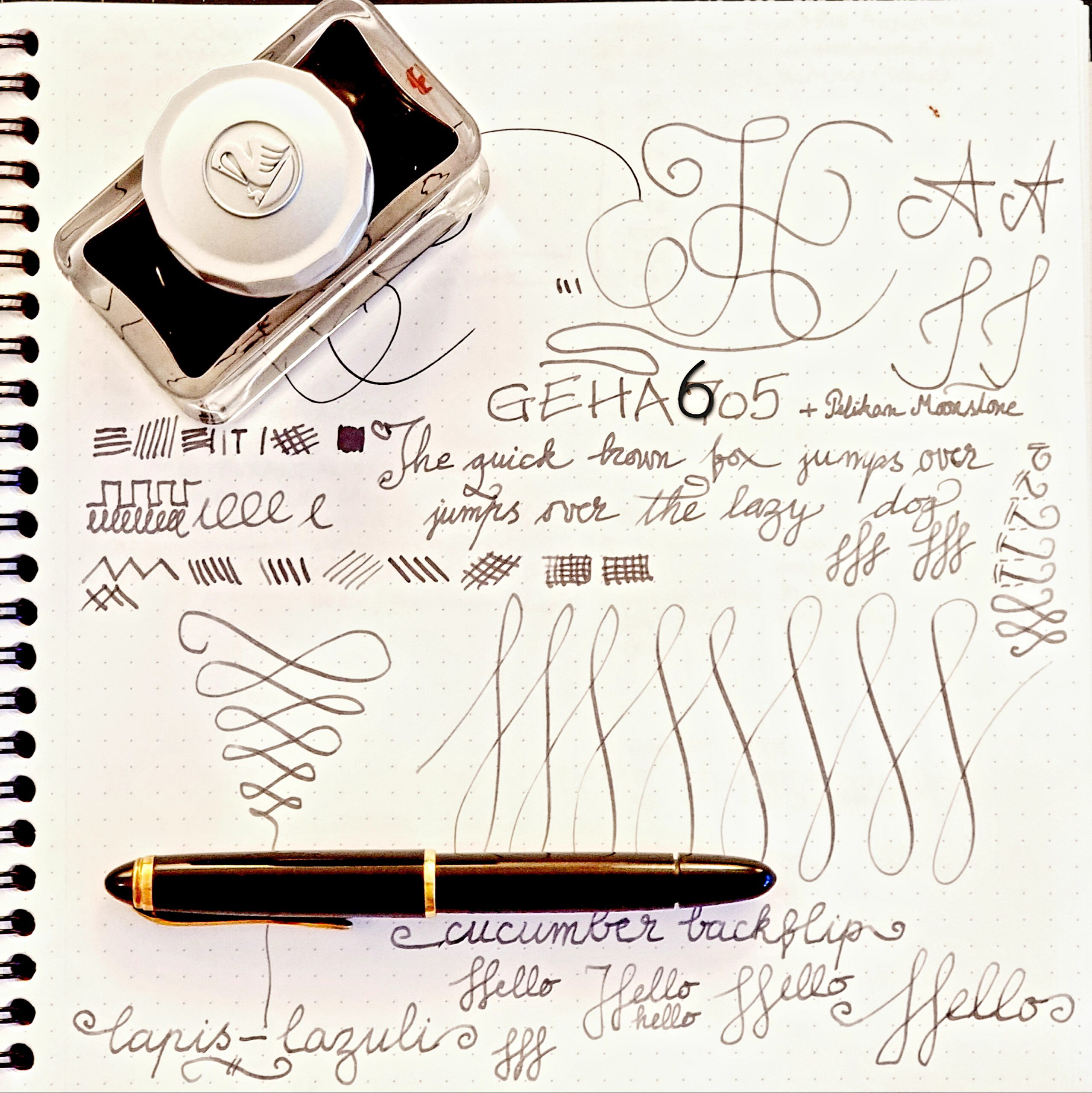
I inked it with a classy ink, the Pelikan Edelstein Moonstone, and went on through an amazing tryout session. This pen is outstanding.
The details (see Figures 1b and 1c) are – to me – remarkable. An effortless pen with springy and flexy nib, inked with a nice and shady ink. It’s quite difficult, not to mention very expensive, to find such pens in modern lineups of pen makers catering to a general audience.
A drop of history: According to Werner Ruettinger [RW], GEHA (used interchangeably with “Geha”, and in logos and imprints even “geha”), the acronym for Gebrüder Hartmann (Brothers Hartmann), started in Hannover, Germany just after the First World War. It was not until after the Second that the company decided to focus on fountain pens.
At the beginning of the 1950s, Geha launched a series of fountain pens for students, the Regent line, with models in tbe 7xx range, and gold or stainless steel nibs. This line progressed until 1956, when it was discontinued for something clever(er) and better.
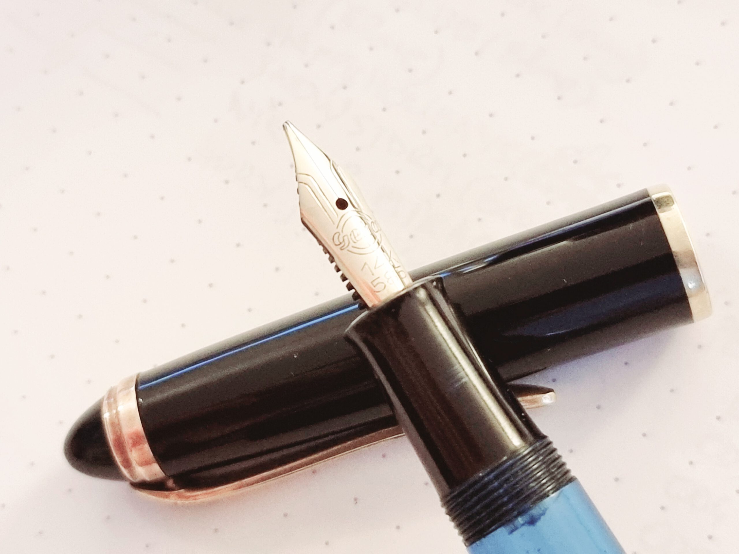
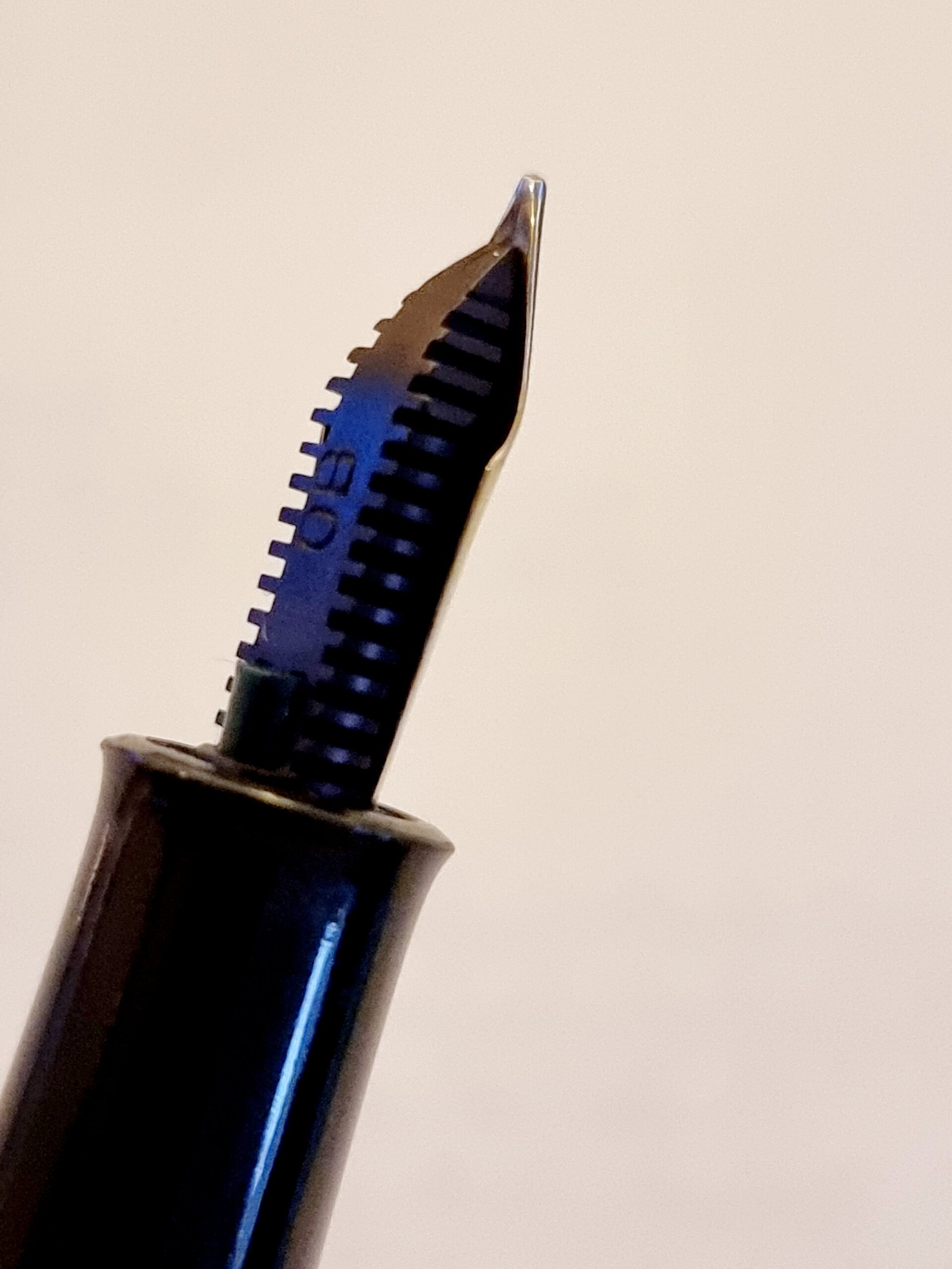
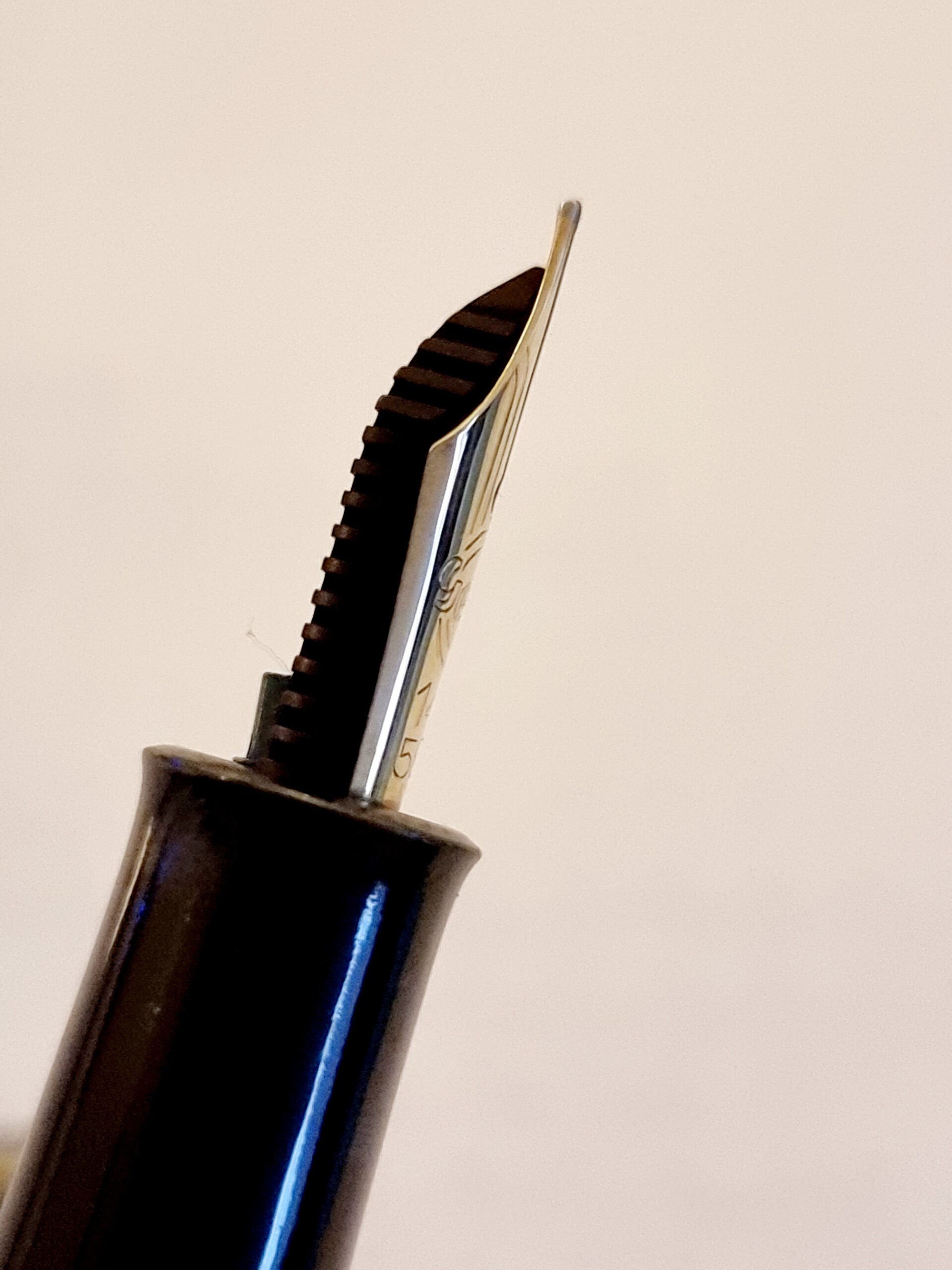
In 1957, motivated by the problem that using all the ink the reservoir left the user unable to continue, Geha introduced the reserve tank, a secondary ink chamber, protected by a valve, which could store additional ink for about a page (or maybe two). The pen user, upon discovering the ink is up in the main reservoir, would use a (green) button, conveniently placed under the nib, to release the valve and thus the ink of the second (reserve) reservoir. (Geha never solved the problem of discovering all the ink in the secondary tank was used-up.) Figures 4b and 4c depict the green button.
The second-reservoir idea was successful, and between 1957 and 1961 Geha produced high-quality pens, conveniently priced and competing with Pelikan (and Kaweco) for market-share.
Similarly to Montblanc and Pelikan at the time, Geha marketed three tiers of pens. The tier (and pricing) of a pen are suggested by the number of steps in the upper ring of the cap; as we will discuss later in this article, the Geha 605 pen has two steps, which indicates the second most-expensive line (like the Montblanc 2x or 2xx, or the Pelikan M4xx when the M6xx was its top tier, so until 1987). The most-expensive tier is indicated by a three-step structure, and the third tier is indicated by only one step.
(Geha will cruise through the 1960s with another innovative design, the Goldschwinge inlaid nib with art-deco looks, introduced in 1962. More about that nib, and the line of pens it generated, in a future post. For now, Suffices to say it’s not a flexy nib, quite the opposite – a nail.)
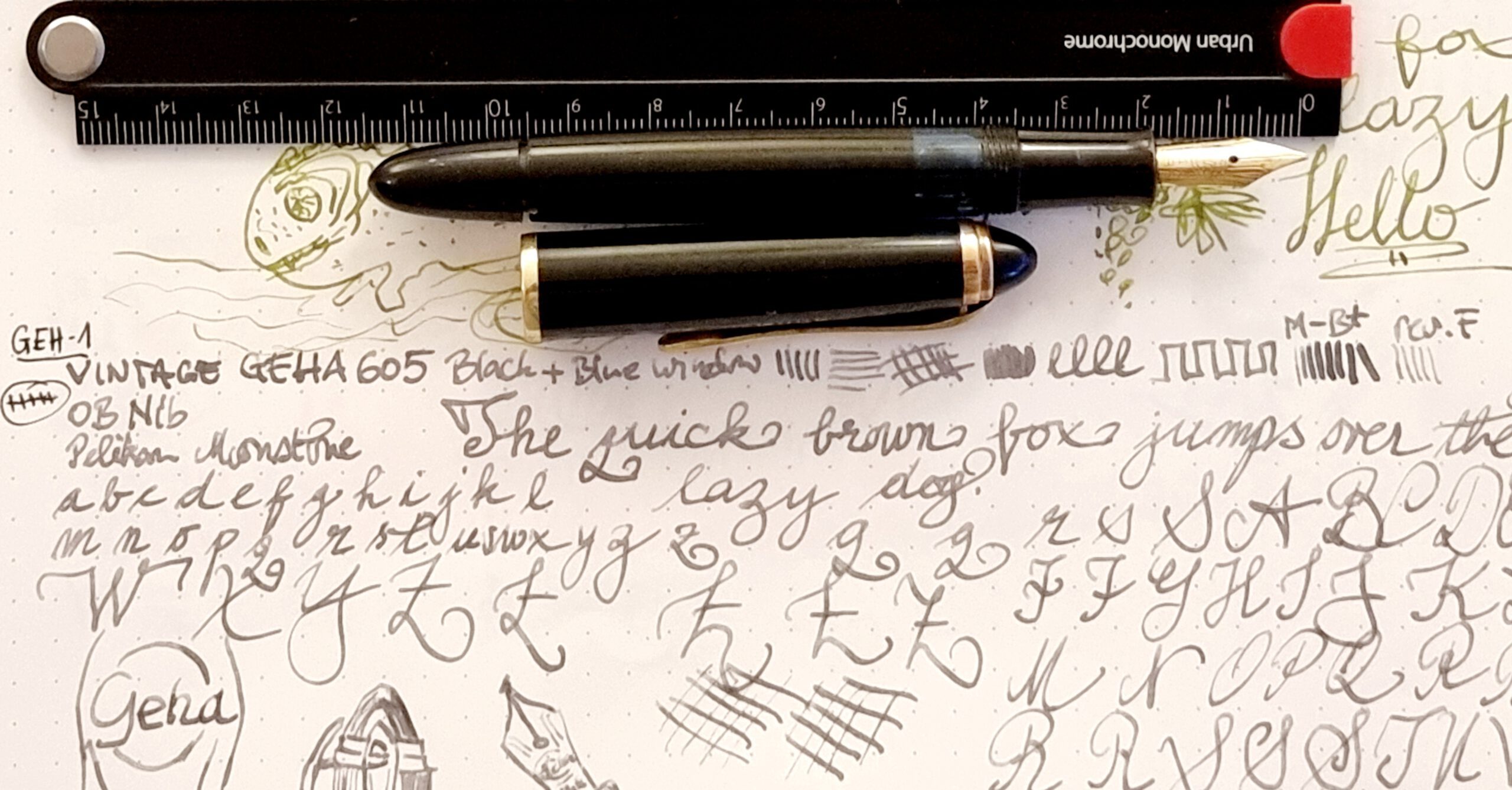
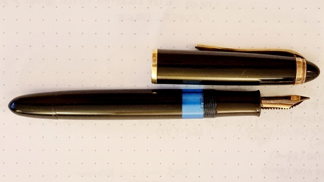
Dimensions: (see Figures 2a and 2b) Small pen uncapped, good size posted, long nib.
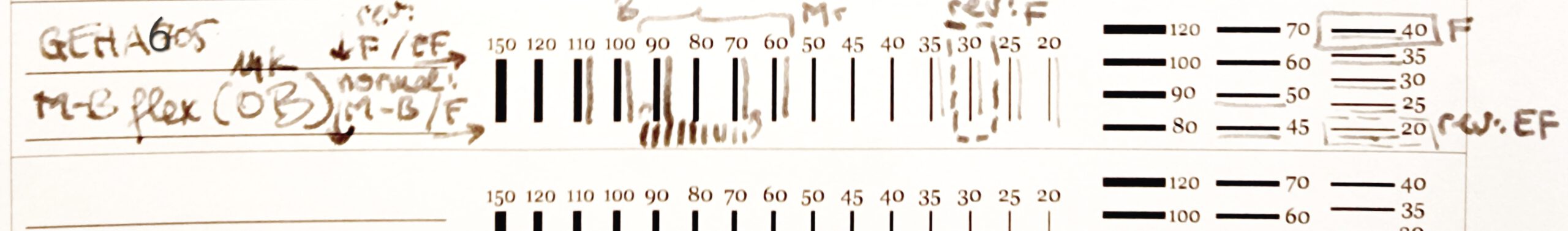
The stroke width is more complex to measure. I experimented on regular printer-paper, based on the Fountain Pen Network template (see Figure 2c):
- In normal writing (feed under the nib, facing the page), the downward stroke is 0.6 mm wide without pressure (size: M) and 0.9 mm with some pressure (size: B); OB nibs of the 1950s are thinner than today’s. The horizontal stroke is 0.3 to 0.4 mm wide (size: F).
- In reverse writing (feed facing upward, toward the writer), the downward stroke is around 0.3 mm (size: F) and the horizontal stroke is around 0.2 mm (size: EF).
Looks and details: (see Figures 3a and 3b) The pen itself is very well made, with numerous elements we still associate today with high quality. These elements include:
- Pleasant looks (Figure 3a). Clean, aerodynamic shape. Mechanisms include a piston filling system and a ligh-blue ink view. The pen is threaded, which at the time gave the maximum protection against drying out.
- Classy cap (Figure 3b). The art-deco cap ends with a black crown over a two-step gold-plated ring – the flagship pens had three steps -, a springy clip, and a strong logo. (A ring at the end of the cap, close to the threads, appears in Figure 2a.)
- The ‘reserve tank’ actuated by a tiny button at the foot of the nib is unique. (Figures 4b and 4c)
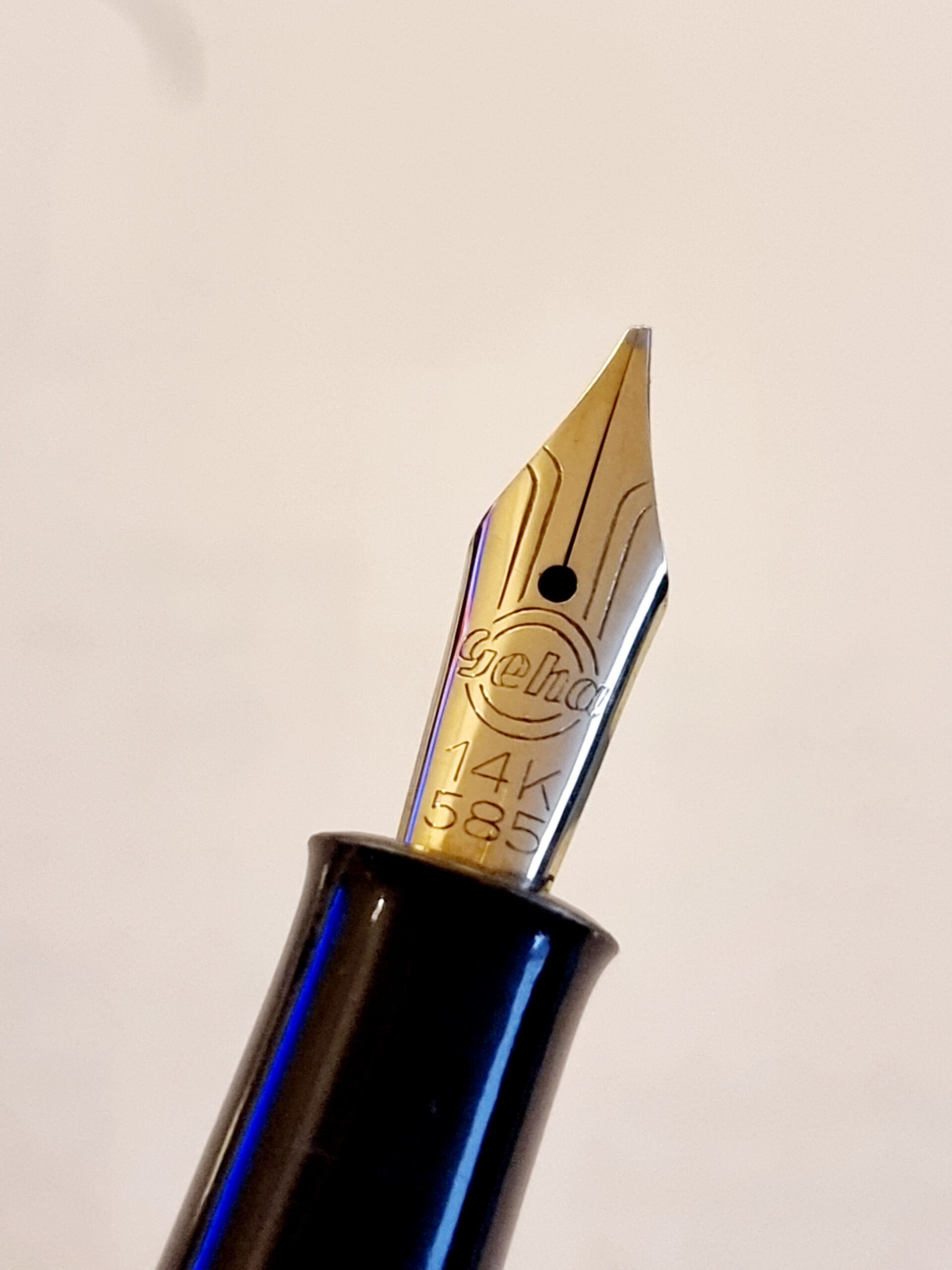
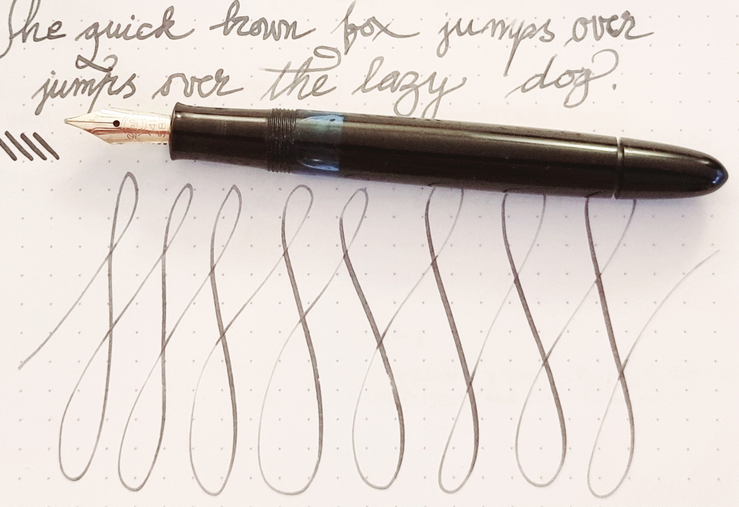
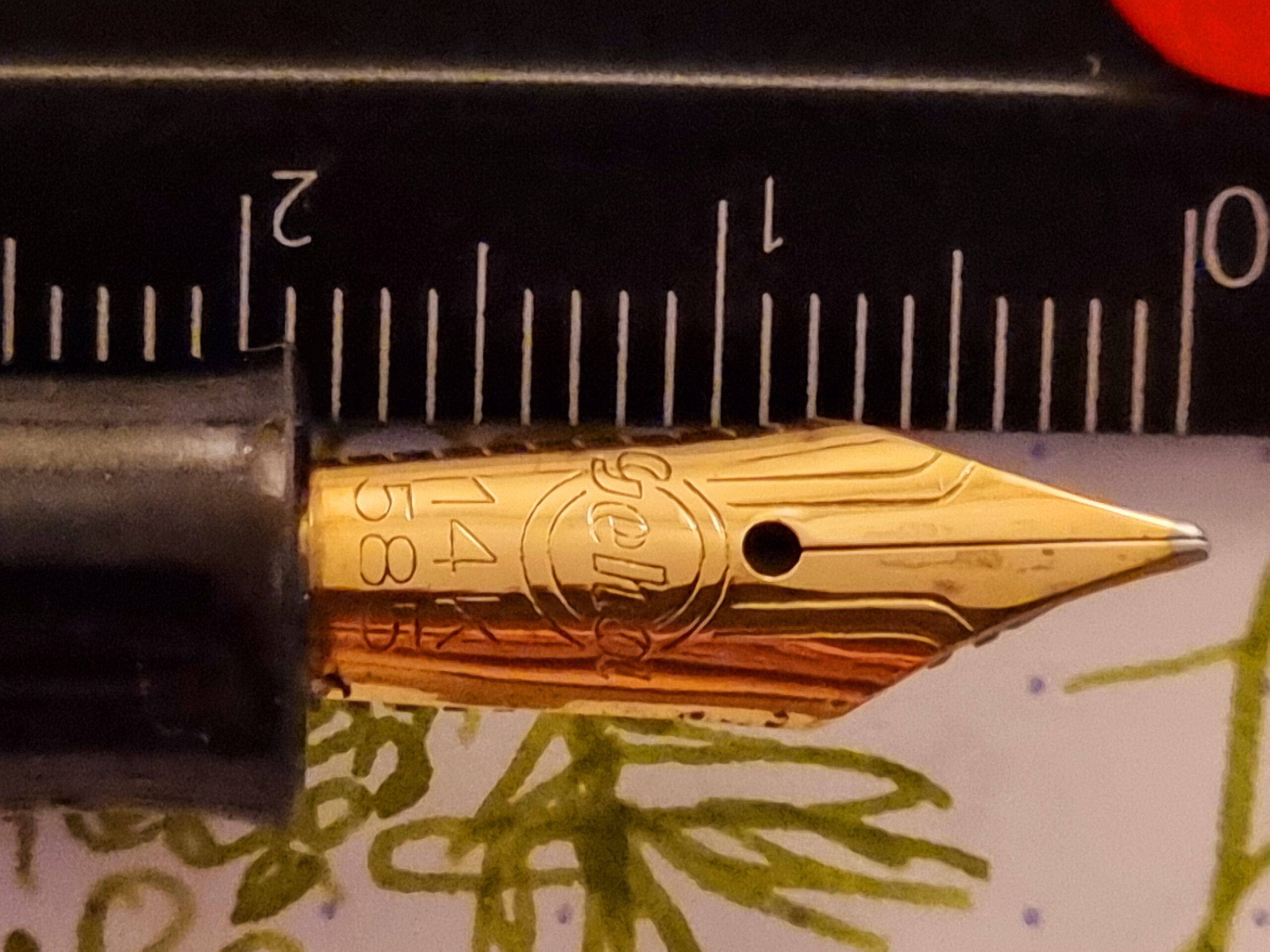
More on the nib unit: Good to great! (see Figures 4a, 4b, and 4c) This is a prototypical vintage open nib made of 14k-gold in post-war Germany. It’s large, sticking our far from the grip, which gives excellent control when writing and drawing.
It’s engraved with the distinctive Geha markings, which include the logo text, circles around it, and deep troughs toward the tip. There’s a clear inscription of the gold purity, “14K” and “585”.
The tip is well made, prominent and pleasant to use even after neary seventy years since the pen was manufactured in Germany.
To conclude:
Try out today a Geha 6xx or 7xx series, especially one with a gold and broad+ nib!
Enjoy the day!
References:
- WWerner Ruettinger, Geha information. Personal website: http://www.ruettinger-web.de/geha-startseite.html Abbrev. RW.