
TL;DR: One more Platinum #3776 Century pen, this time with a bold nib. I appreciate very much the balanced shape, open nib, large grip, and classy details.
Other pens in this series:
- Platinum #3776 Century in Chartres Blue, GT, with 14k-gold SF nib.
- Platinum #3776 Century in Chenonceau White, GT, with 14k-gold UEF nib. (yesterday’s post)
- Platinum #3776 Century in Chartres Blue, CT, with 14k-gold B nib. (this pen)
Overall: This is a well-designed, well-engineered, well-manufactured pen, with a fantastic needlepoint nib.
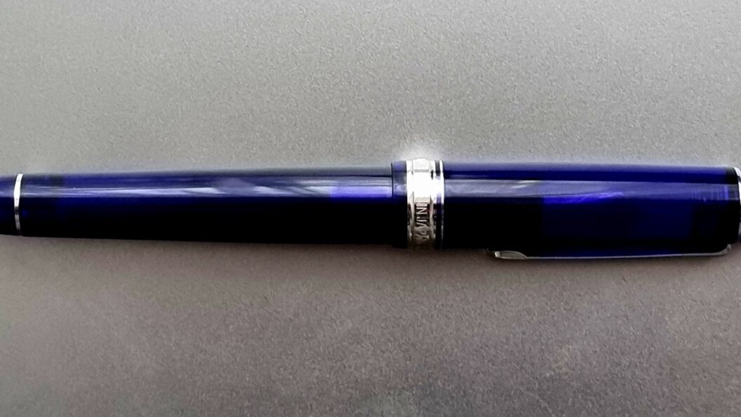
Technical detail: Platinum #3776 Century in Chartres Blue, CT, with 14k-gold B nib. Model id: PNB-15000 #51-4 B, sold at ¥15,000 MSRP. (There are several models very similar to this one, with the line including models PNB-15000[A] and PNB-18000[CR] at the moment. This pen is the former.)
The rated length is 139.5 mm (5.492″); the rated max diameter is 15.4 mm (0.606″). The weight is 20.5 g (0.723 oz), so a light pen because of its AS resin material.
Relatively to the pen from yesterday, this pen has a different tip, B vs. UEF. Relatively to the other two 3776C pens I’ve showcased so far, this one is ST instead of GT: silvery, not gold-like, rhodium-trimmed furniture and rhodium-plated nib.
The Platinum #3776 line was introduced in 1978, as “the Ideal fountain pen”, emphasizing the ambition Platinum had for it. The number, 3776, is the height of Mt. Fuji (in meters); tongue-in-cheek, naming this line after the tallest peak in Japan is surely not aimed as a reminder of Montblanc’s famous 4810 line/nib imprint. The Century sub-line started in 2011, adding an interior plastic mask, the “Slip and Seal”, that seals the nib and prevents its drying out; the launch coincided with the launch of the Platinum Carbon Black ink, a permanent ink you would not like to dry out inside your pen or your feed and nib-slit could get permanently clogged. In 2012, the 3776C fountain pen in demonstrator Burgundy wins the Japan Stationery of the Year Award, emphasizing the status of 377C as iconic pens. In the #3776 Century sub-line, the Chartres Blue was launched in 2013, but the rhodium trim appeared later, in 2015.
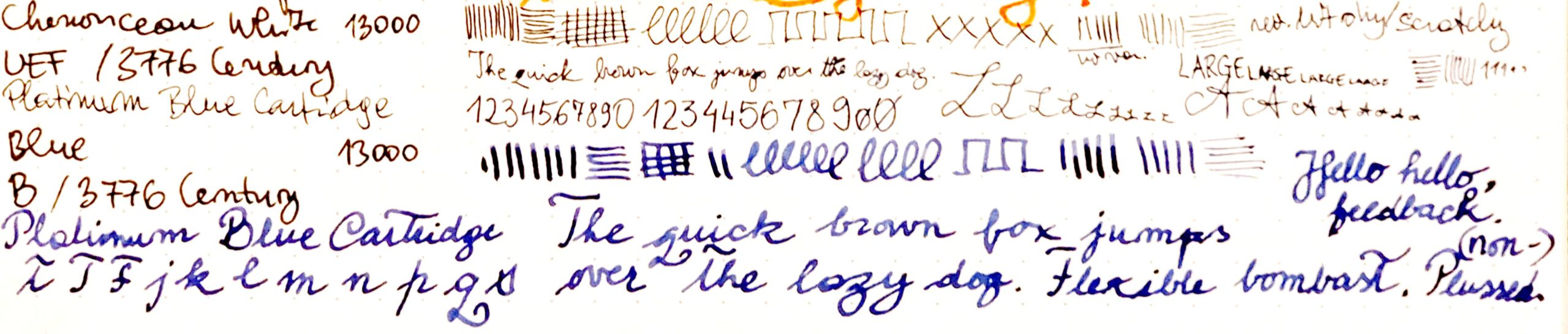
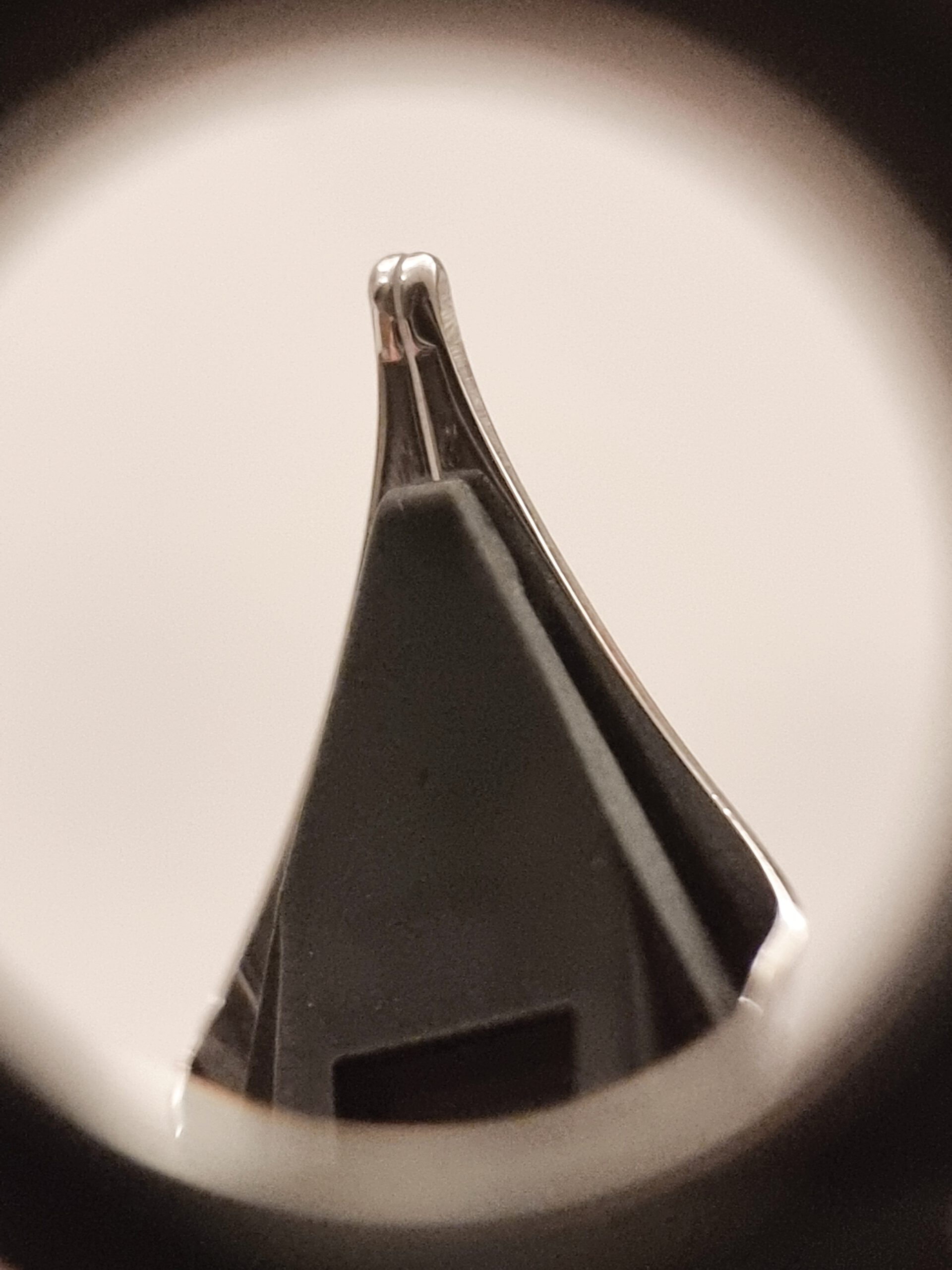
How does it write? (Figure 1, B nib at the bottom)
It’s a smooth nib with some feedback. I’d place it somewhere the wet smoothness of a Pilot nib and the pencil-like feedback of a Sailor nib.
Line variation does not really exist, but with moderate pressure the strokes are thicker and juicier. There is some flair available for your writing, but still this is a hard nib.
This nib writes comfortably and smoothly also in reverse, grip with feed pointing upwards.
To conclude: Good nib, I enjoy using it!
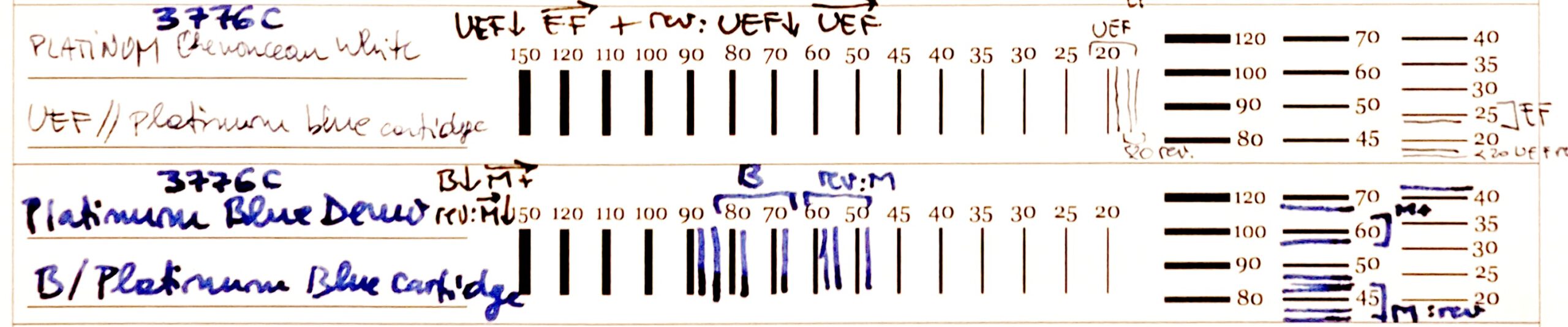
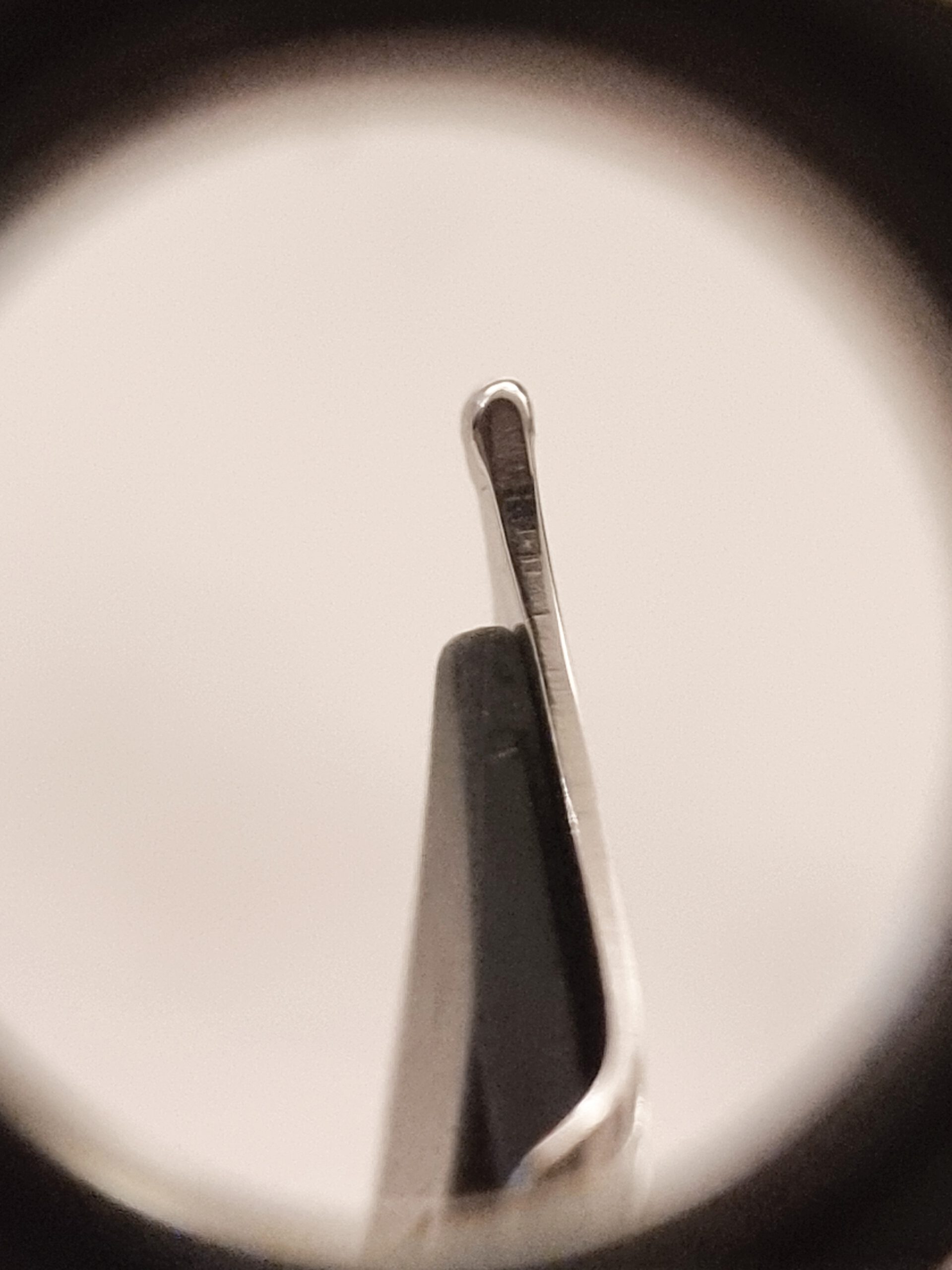
What is the stroke width? (Figure 2, B nib at the top)
The normal grip delivers a typical B stroke on the vertical, downward motion, at 0.7 to 0.8 mm. The horizontal stroke is closer to 0.6 mm, so an M-B stroke in my book.
The reverse strokes are thinner by one size, as expected, around 0.5-0.6 mm vertically, 0.45 mm horizontally.
To conclude: good nib writing characteristics, closer to an M-B than a European B; that I specifically mention European should indicate this thinner broad nib is not typical only of Platinum, but of all major Japanese brands. (Their Fs and EFs are also much thinner than the European equivalently F and EF nibs.) So your mileage may vary, depending on what you use B nibs for.
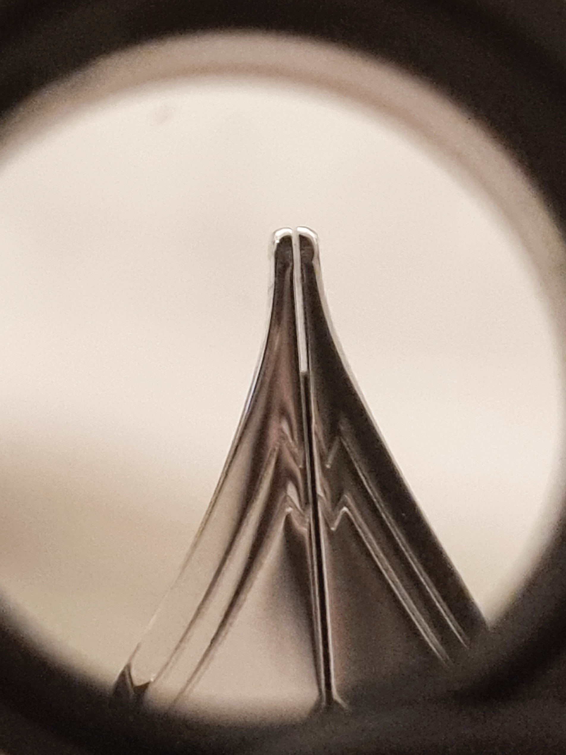
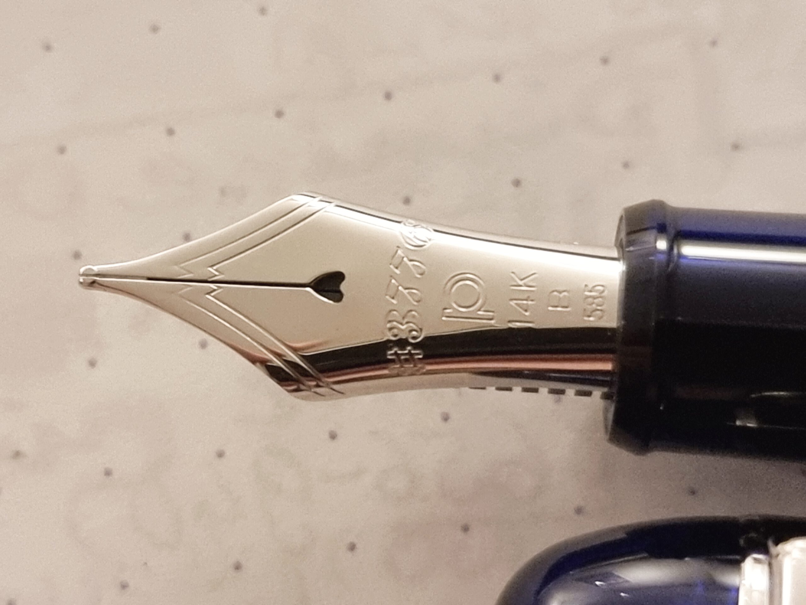
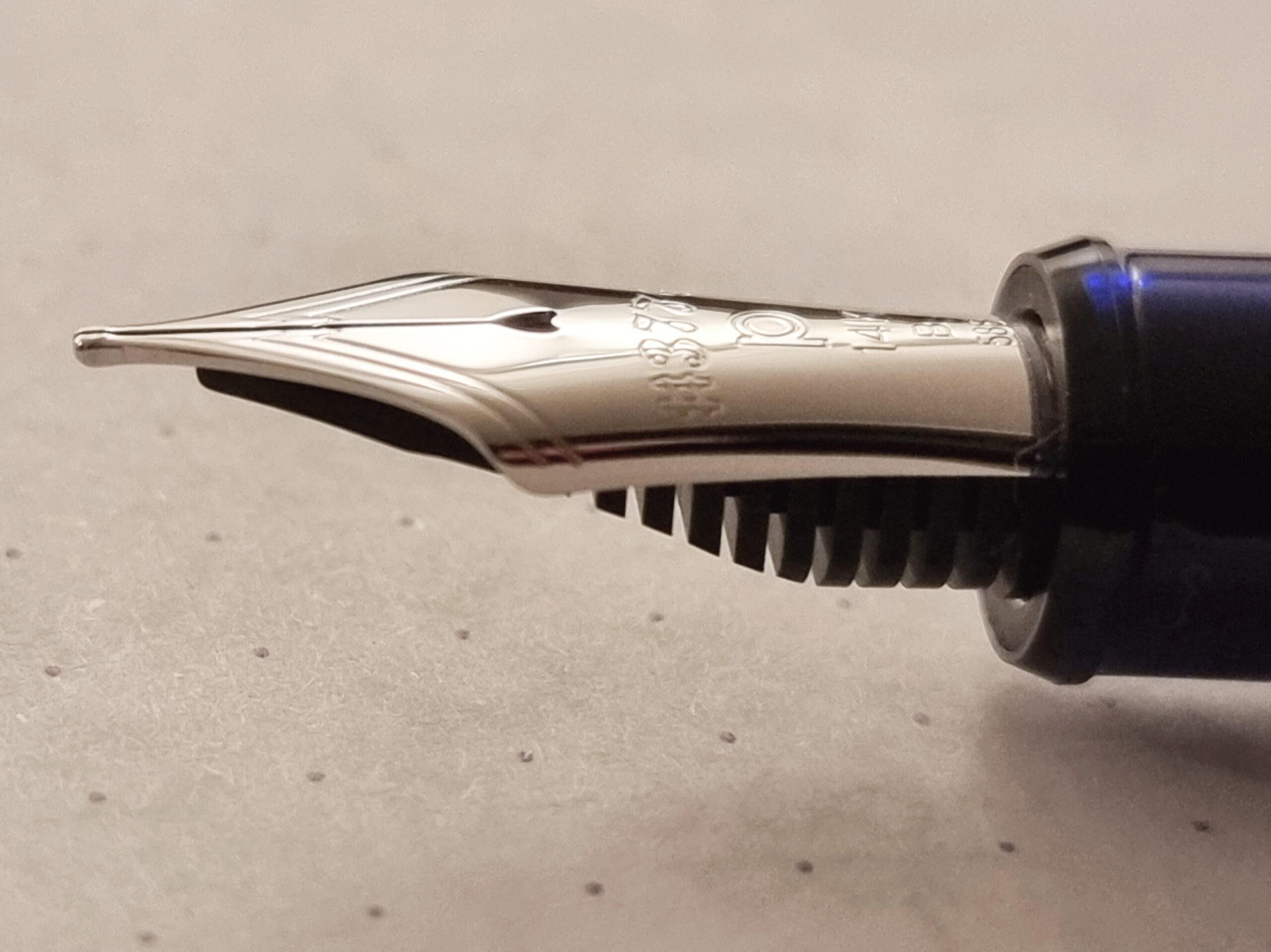
What’s the nib like? (Figures 3a, 3b, and 3c)
A good-looking, rhodium-plated nib, ending with a smooth yet bulbous tip. Writes well out of the box. Typical Platinum.
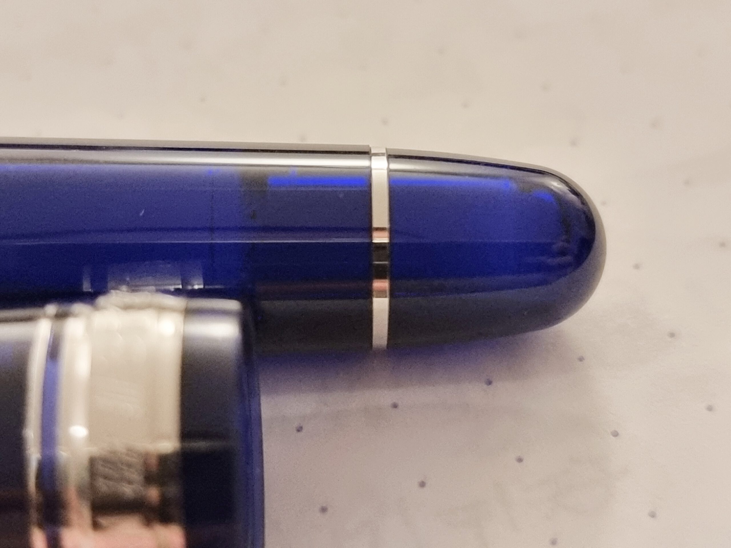
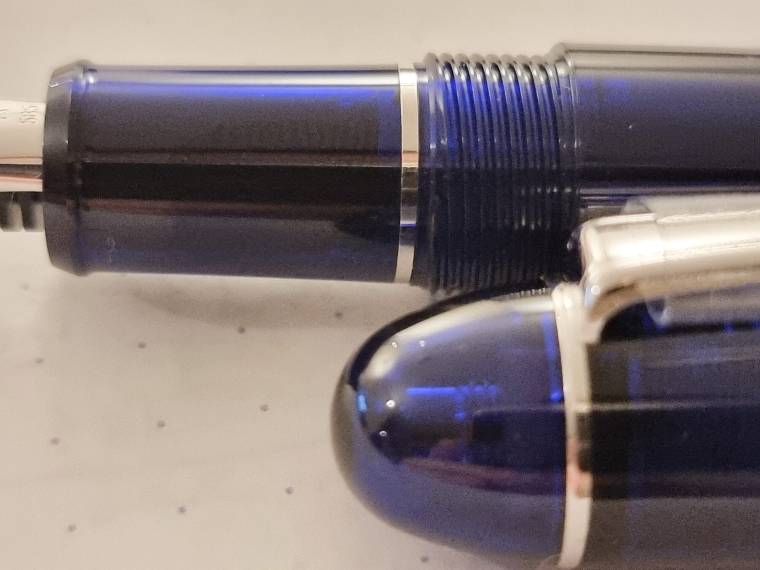
Design, engineering, and manufacturing: Excellent. (Figures 4a-4f)
This is a pen to look at and enjoy. The demonstrator characteristics, that is, the transparency of the material, reveal much of the inner workings. You can also see the ink in the cartridge or the converter and, because the blue tint is strong, you will not be distracted regardless of the ink color.
I particularly like the grip (Figure 4f), which is just long and girthy enough so I can use it comfortably. YMMV.
I also like that this pen is sturdy, so I will not mind bringing it to work.
I’ll repeat the trick from the last post:
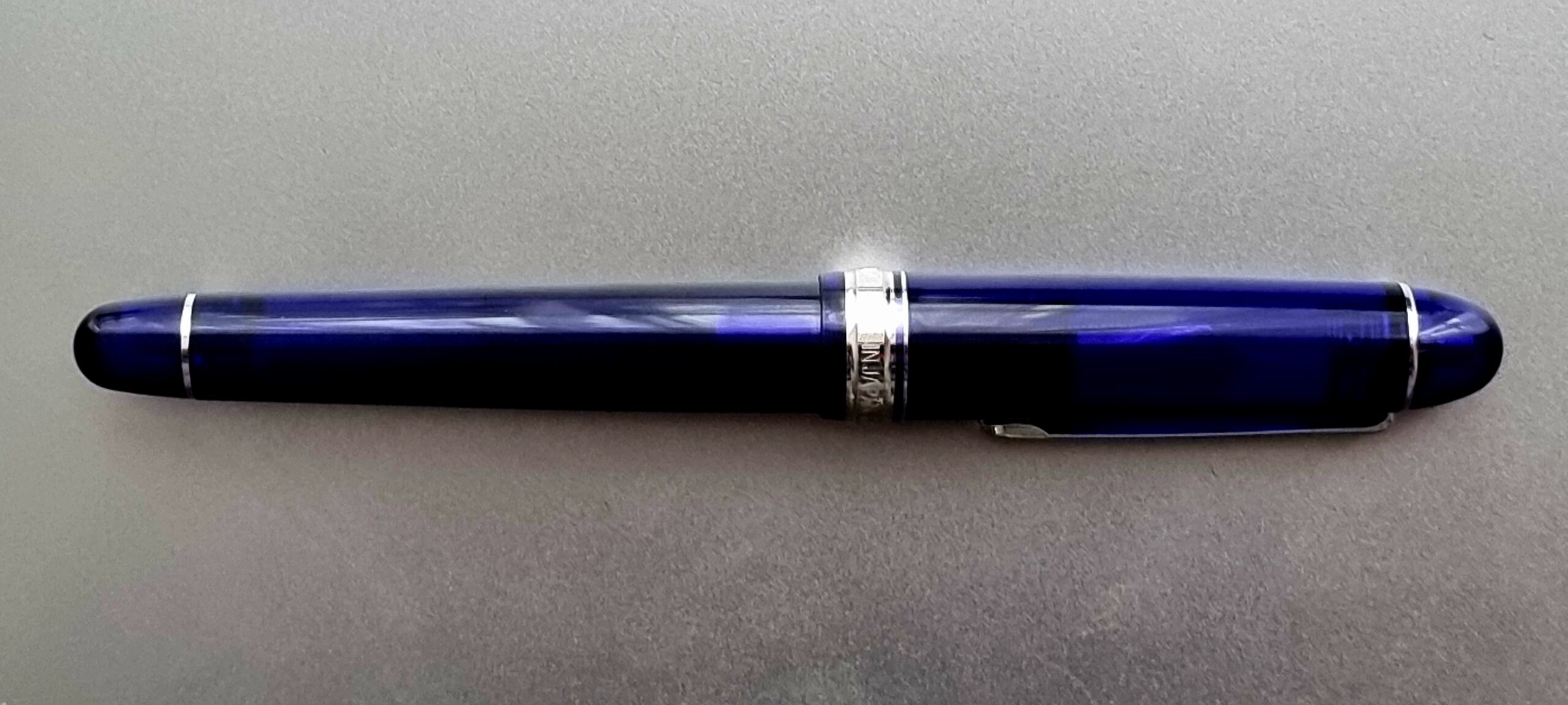
Let’s end where we started (Figure 5):
Conclusion: Excellent pen that works out of the box! Your mileage with the bold nibs produced by Platinum may vary.
Enjoy the day.