

TL;DR: A day of trying out pens, inks, and paper. This is the wonderful Tomoe River 52 gsm that comes in the Galen Leather Everyday Blank, B5-size notebook as 400 densely packed pages. I tried it with various fountain and dip pens, and liked its feedback. Figures 1 through 10 capture some of the joy.
Unpacking experience: great!
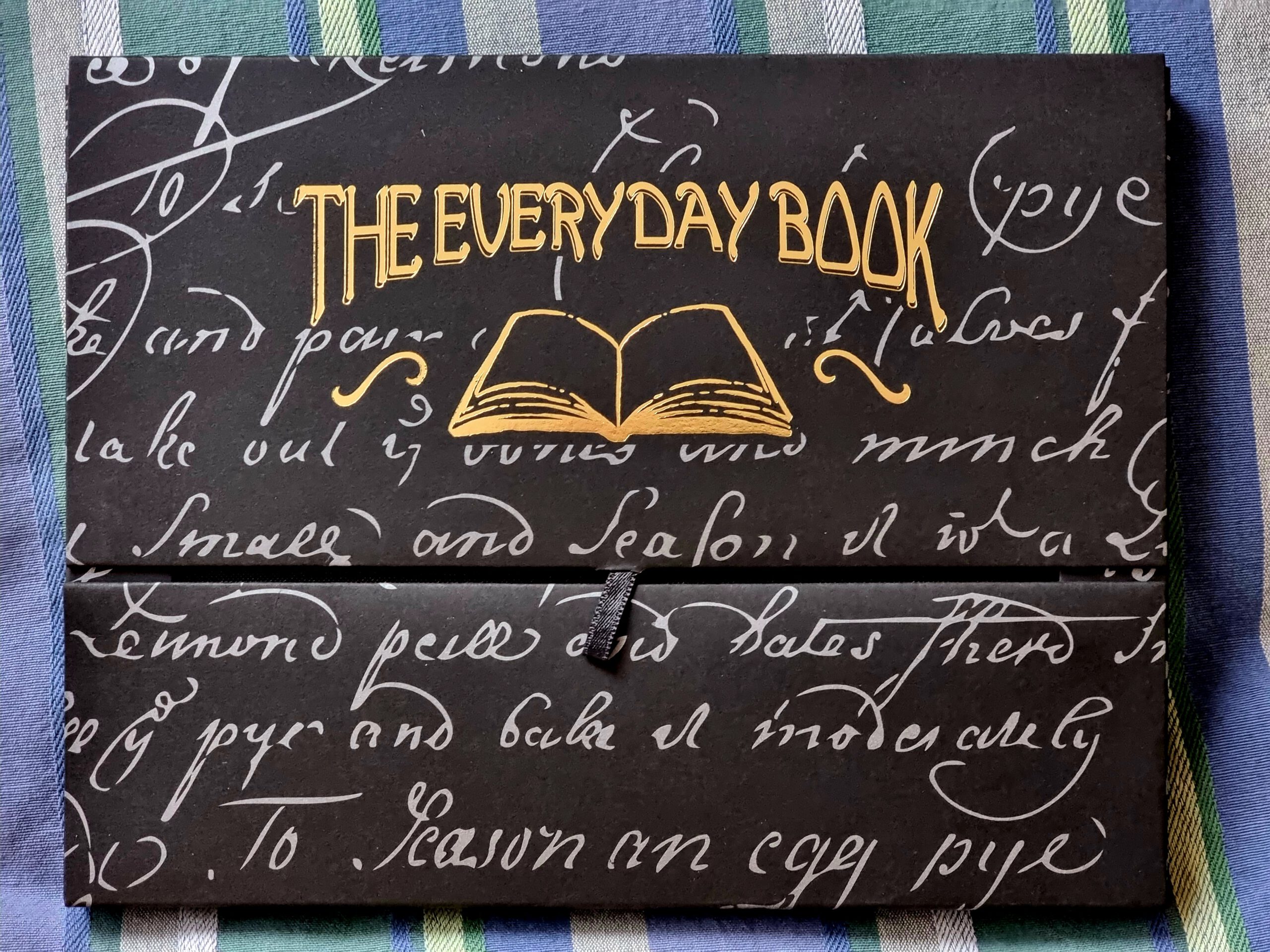
The notebook comes in a lovely package (see Figure 2). I like this black-cardboard box with silver background text, and golden logo and name. There are various other high-quality marks, such as the outward string that acts as opener and the magnetic closure mechanism (just leave the cover on its own and it will close shut).
Inside (Figure 3), there is the densely packed notebook with black cover, plus two lined pages of thicker paper to use as guidelines (place under the blank page while writing), plus an ink blotter which can also be used as hand-separator to protect from smudging the page with body oils (good for drawing, or for writing non-linearly on the page).
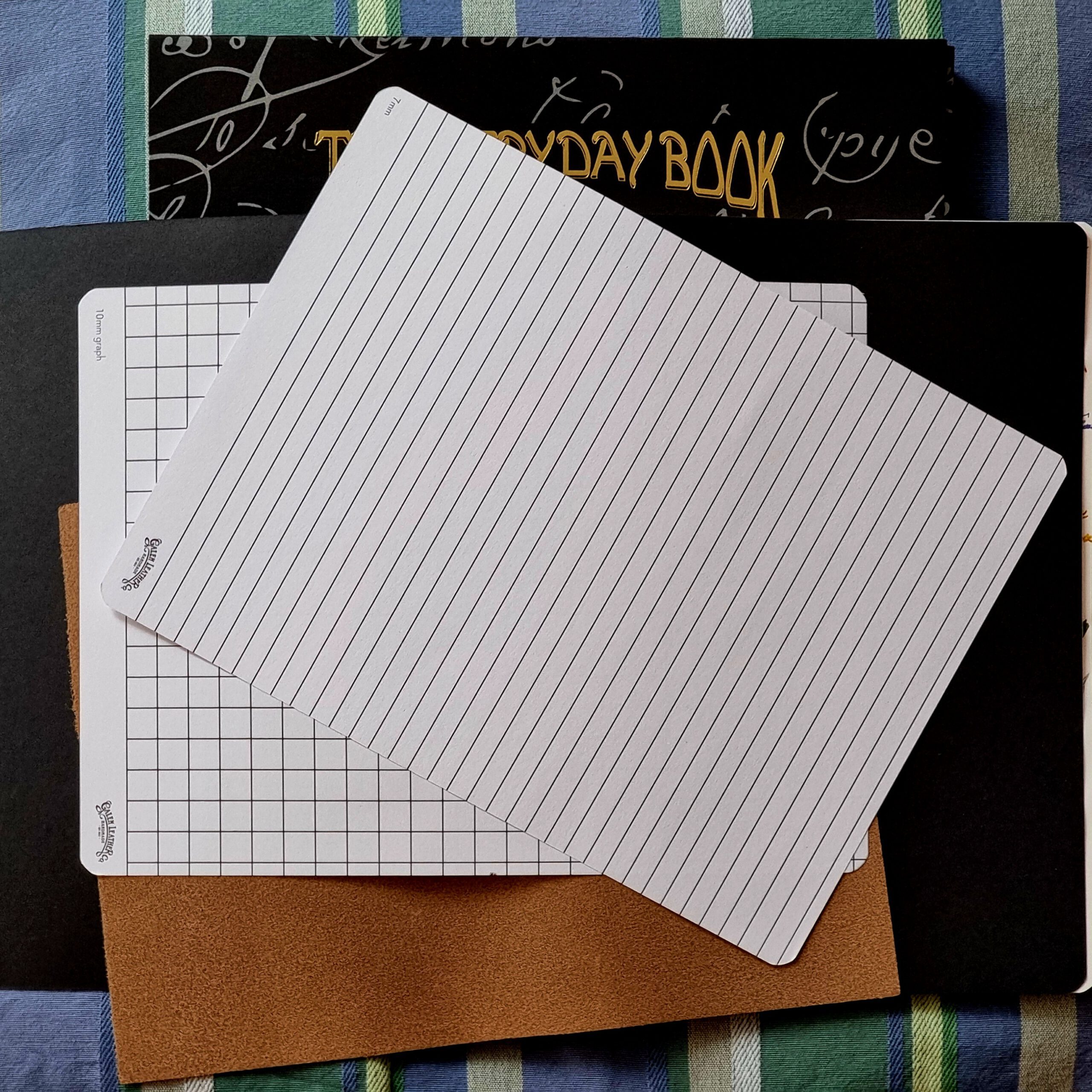
The booklet is densely packed, with 200 sheets in 1.3 cm (0.51″) of height. I chose the B5 booklet, so 19 cm x 25 cm (7.48″ x 9.84″). The pages are made of Tomoe River 52 g/m2 (gsm), hand-bound. The paper is white but closer to ivory, so soft, shaded, white-yellow, and between natural white and cream.
Writing experience: sounds good!
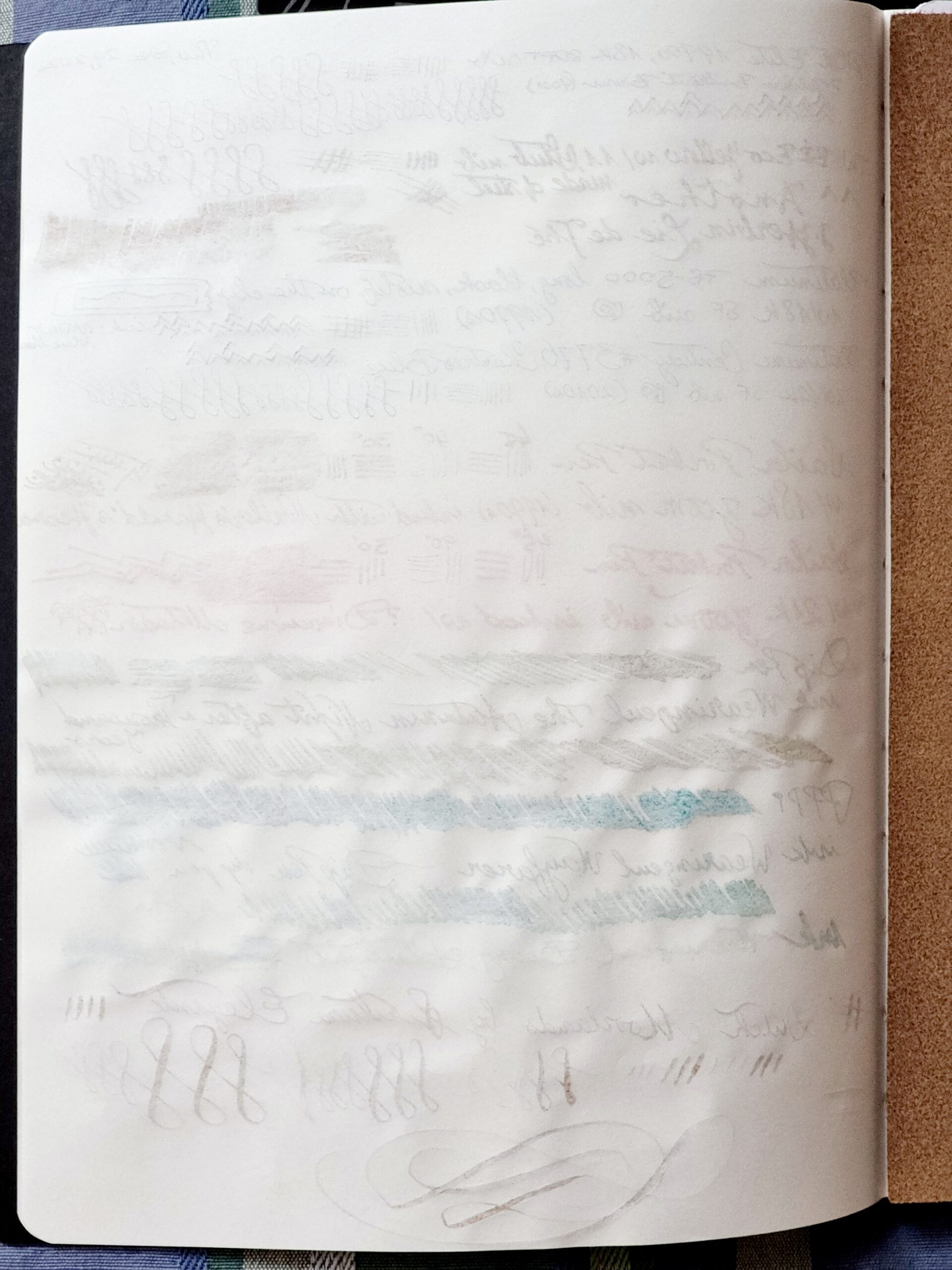
The paper is crisp. There is feedback, with a pleasant tactile response that follows every move of the pen. This Tomoe River makes a kind of music when writing in rhythm, a sound that people writing with dip pens with steel nibs, e.g., a Tachikawa G-nib when writing/drawing manga, recognize and (hopefully) appreciate. In contrast, the Tomoe River paper in the Hobonichi Techo, or the Midori paper commonly used in high-quality journals, is smooth and produces almost no sound during the writing process.
The paper absorbs very well, but slowly. The ink droplets produced by regular strokes start pooling together on the paper (Figure 4) and can take a long time (minutes, for the dip-pen application of a wet ink) until getting through the paper.
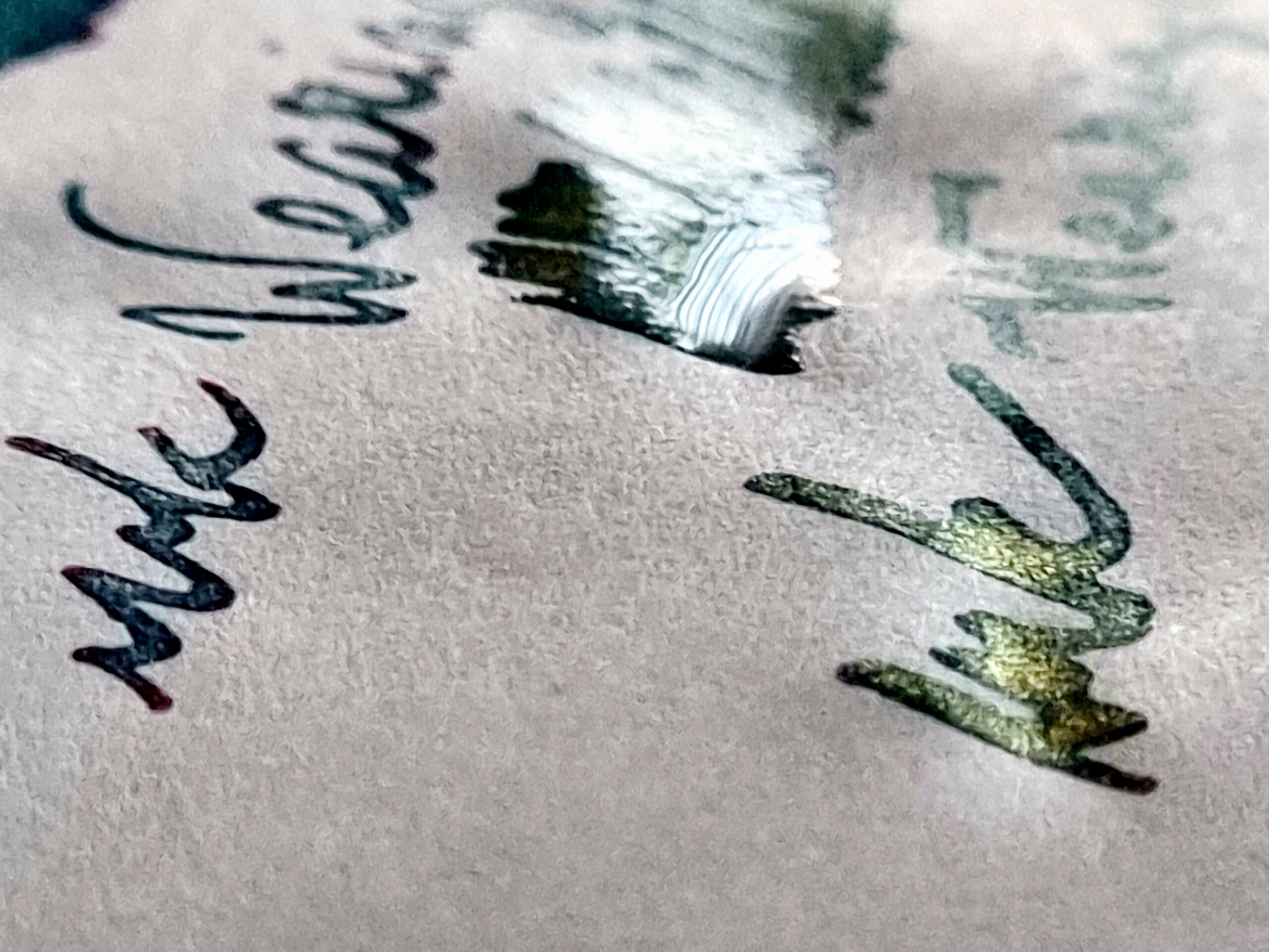
There is see-through (Figure 5) for the heaviest application of inks, so writing on both sides would work for me only for normal writing and with small nibs (F-tipped or narrower). However, the paper does not let moisture go through on the other side, even when the ink pools strongly, so writing on both sides should work well when it’s done with dryer inks or finer nibs.
The process? Lots of pens, lots of inks, fun!
This was quite an adventure to setup.
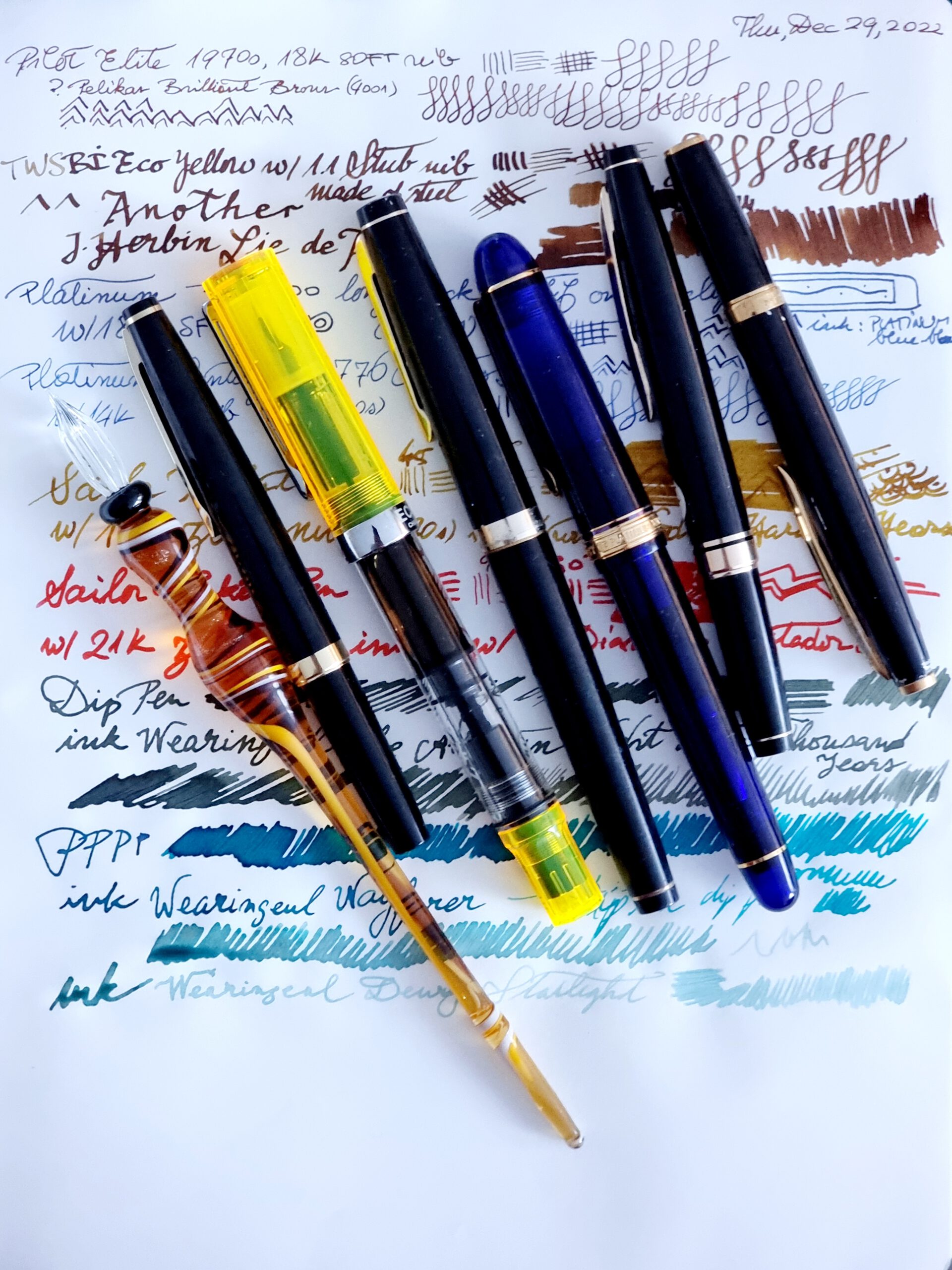
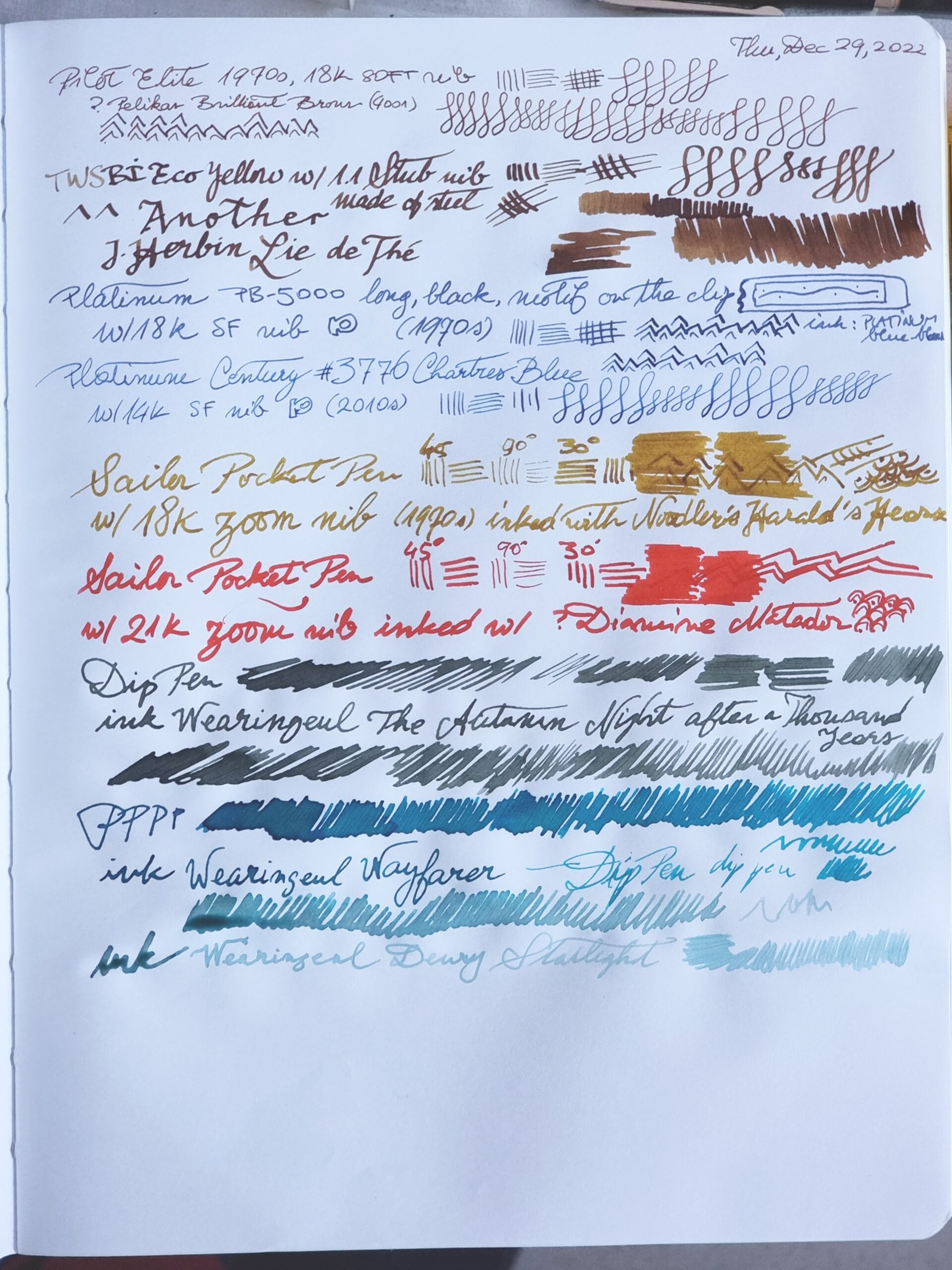
First up, the pens and their inks are (left to right):
- Dip pen made by the Glas Studio in Goslar, Germany. Travel-pen indeed. This I used for all the inks with glimmer.
- Pilot Elite S (short) pocket pen from the 1970s, black, gold trim (GT), with 18k-gold SOFT nib (fine-tipped, soft and partly flexible nib), inked with Pelikan 4001 Brilliant Brown brown ink with some shading.
- TWSBI Eco Yellow, demonstrator, chrome trim (CT), with steel 1.1 mm stub nib, inked with J. Herbin’s Lie de Thé brown ink with strong shading.
- Platinum PB-5000 long pen from the 1970s, black, GT, with 18k-gold SF nib (made like the SOFT nib of pen #2), inked with Platinum’s Blue-Black cartridge ink.
- Platinum #3776 Century made in the 2010s, Chartres Blue demonstrator, GT, with 14k-gold SF nib, inked as pen #4.
- Sailor pocket pen from the 1970s with steel painted cap, black, GT, with 18k-gold Zoom nib, inked about a month ago with Noodler’s Harald’s Hearse (or, more likely by the look on paper, Noodler’s Golden Brown). The special feature of this nib is that its cut allows different stroke-widths, depending on how one holds the pen relatively to the paper, left to right, at 45-, 90-, and 30-degree angles in this tryout.
- Sailor pocket pen from the 1970s full resin, black, GT, with 21k-gold Zoom nib, inked about a month ago with Diamine Matador red ink.
A few more inks, which I only tried with the dip pen:
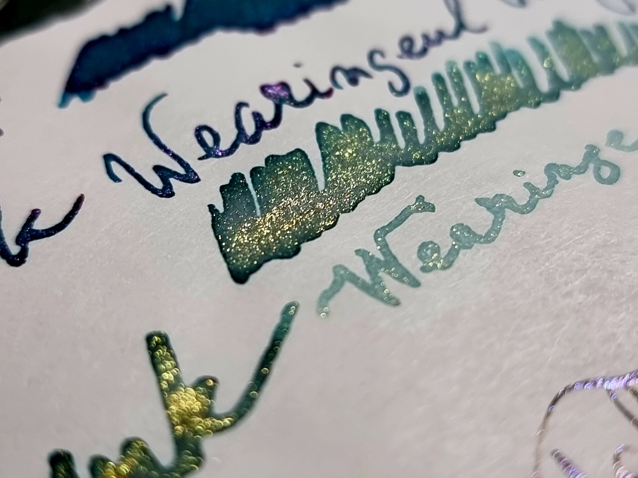
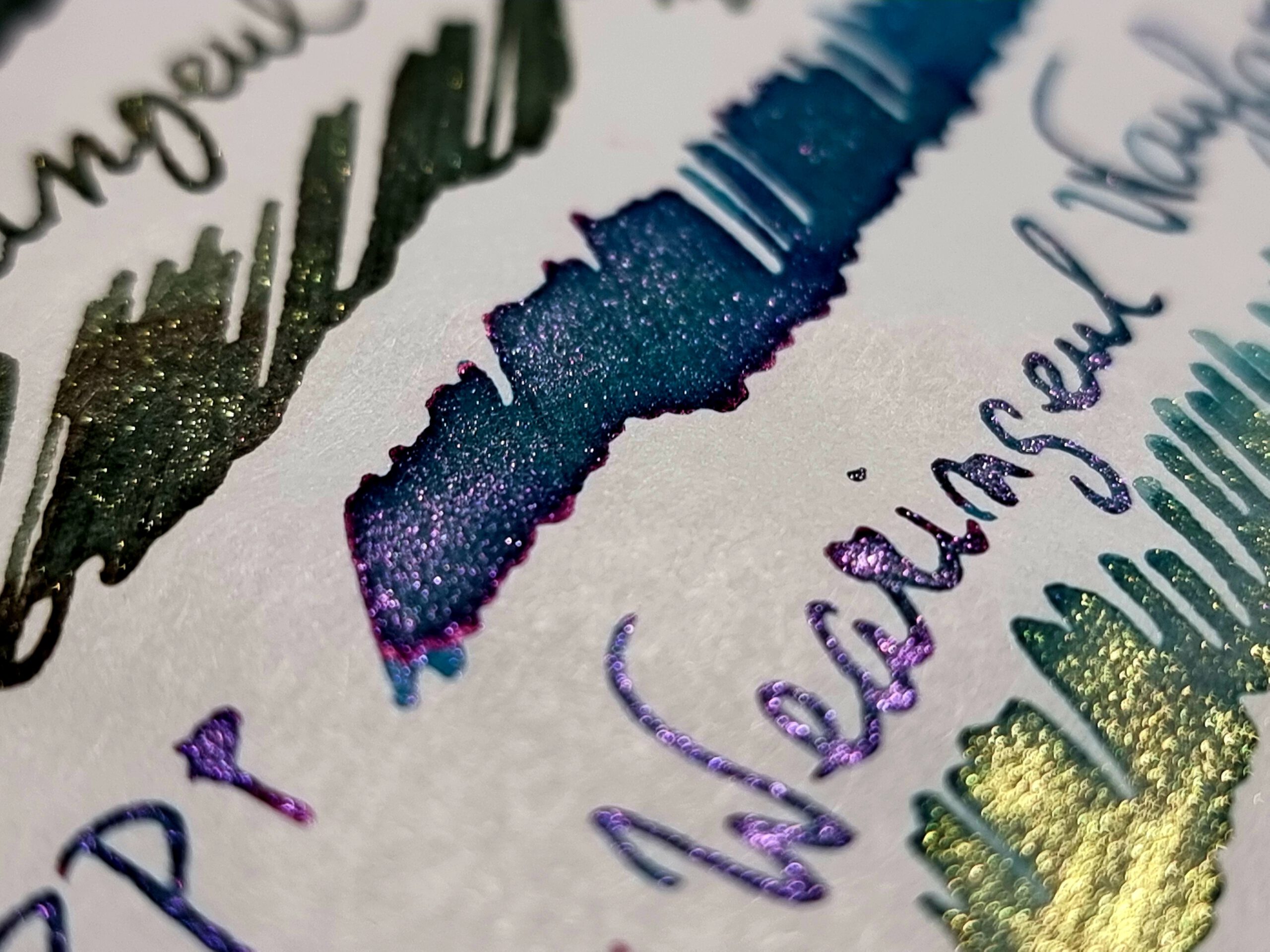
- Wearingeul’s The Autumn Night after a Thousand Years, a gray ink composed from dual colors, verdigris and a reddish dark gray, with strong shading and (golden) shimmer.
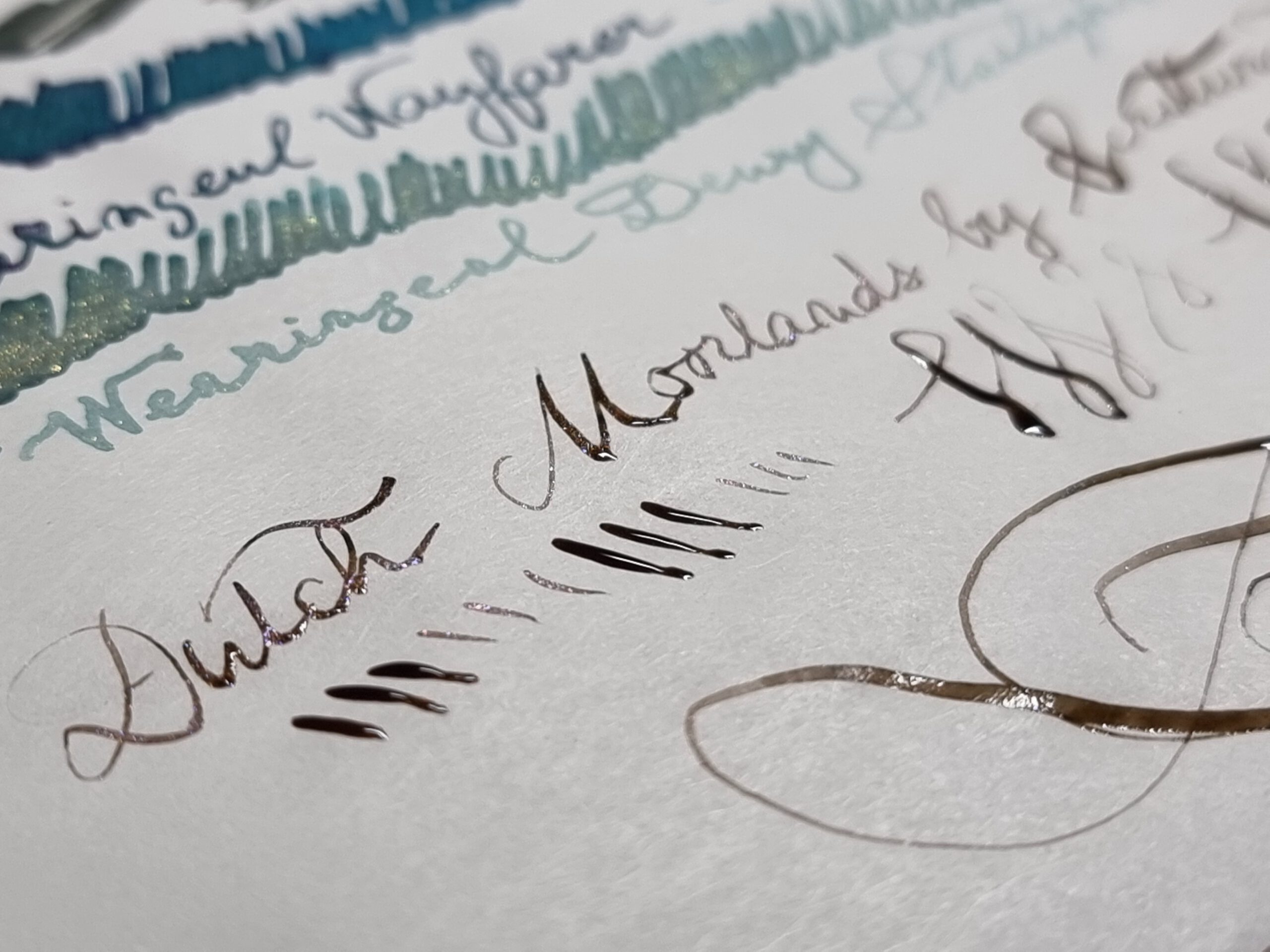
- Wearingeul’s Wayfarer, a turquoise ink composed from the duo dark purple and marine blue, with strong shading and (silver) shimmer.
- Wearingeul’s Dewy Starlight, a teal ink composed from dual colors, light teal and dark green, with strong shading and (golden) shimmer.
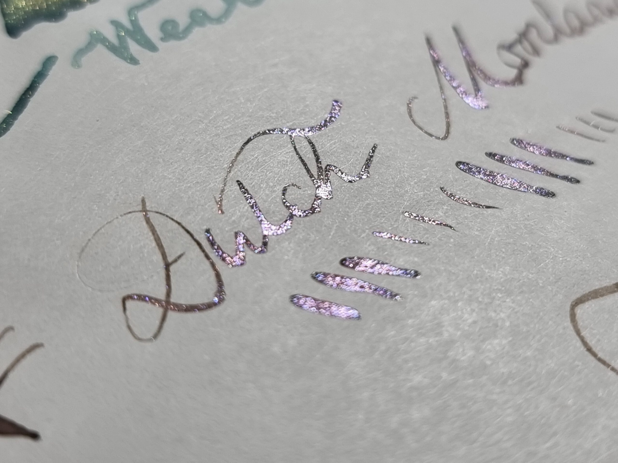
- Dutch Moorlands by Dominant Industry, courtesy Scrittura Elegante, dual-color brown toward pink, with strong shading and (silver) shimmer.
More pictures, because who doesn’t like shine, sheen, and shimmer?
To conclude: try this sometime
That’s it. Ten inks, seven pens, one paper. And it took about four hours to do the test and about three hours to write this.
I’ve had lots of fun doing this.
Enjoy this and have a wonderful day!
One thought on “One Page after Christmas 2022”